
Green Snack Co. Super Stix Health Food Packaging
The Brand Context
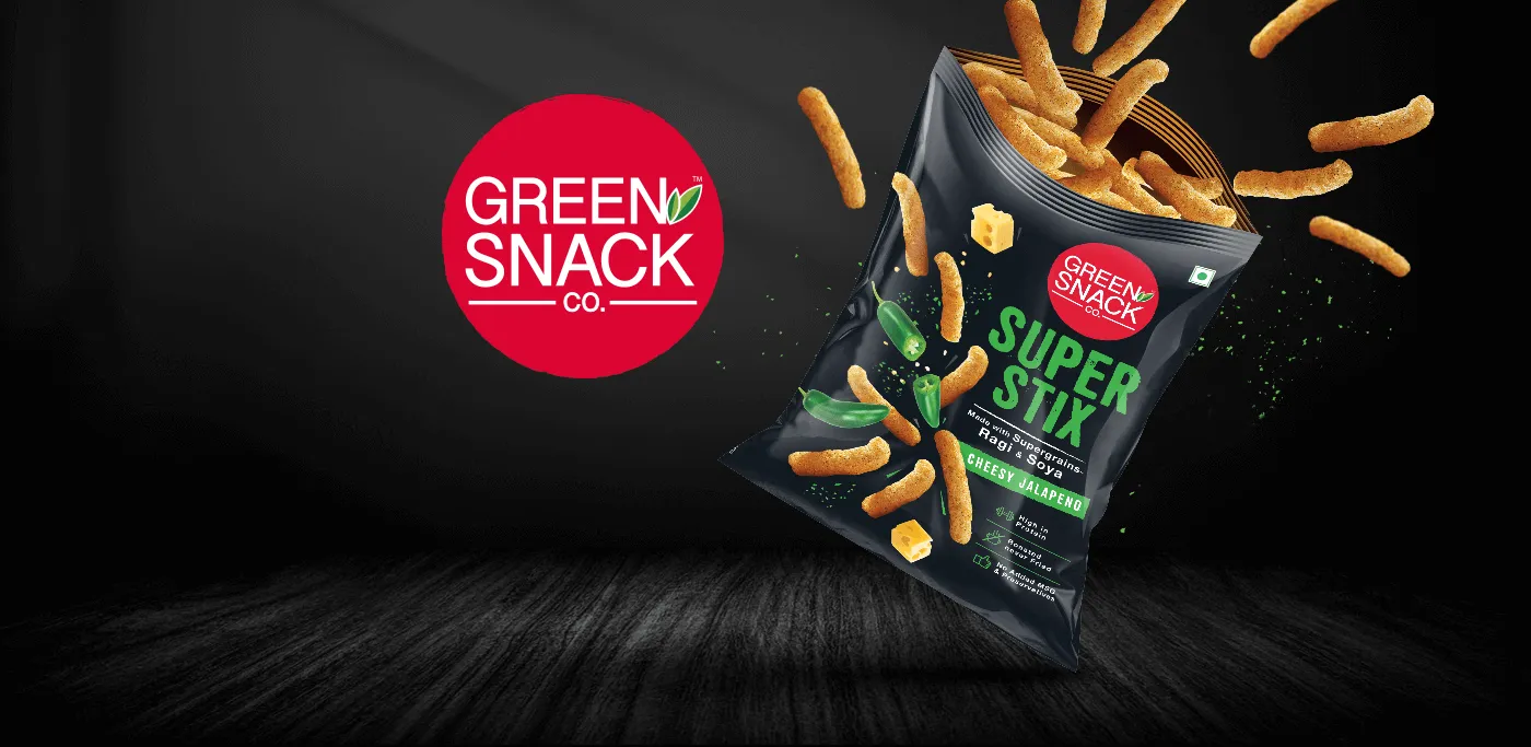
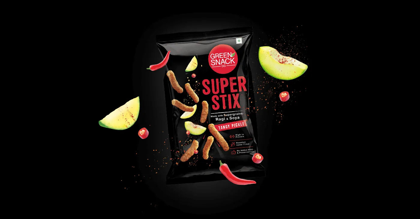
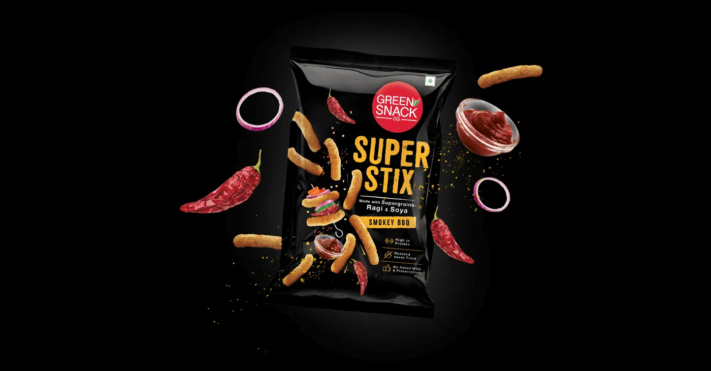
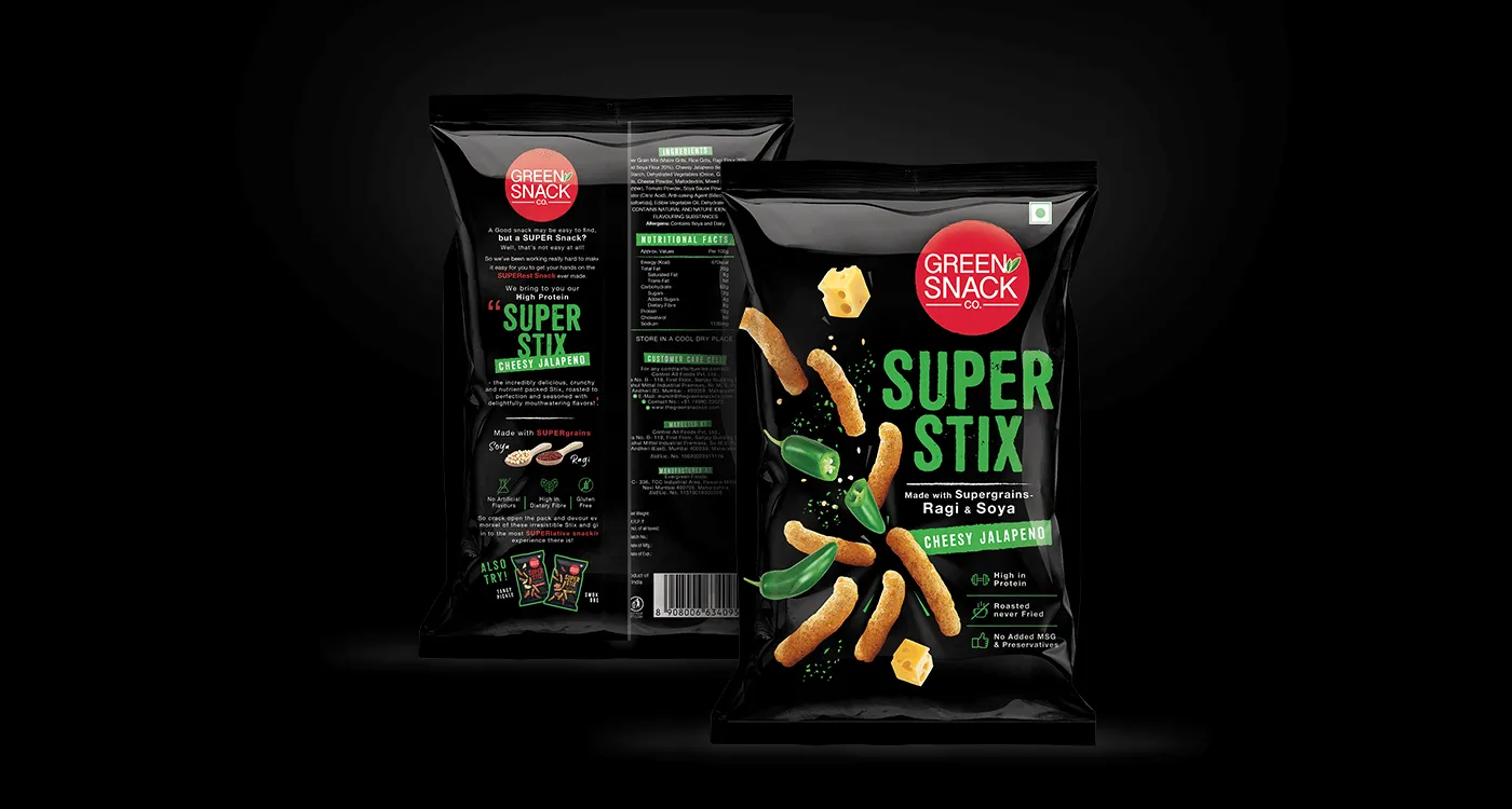
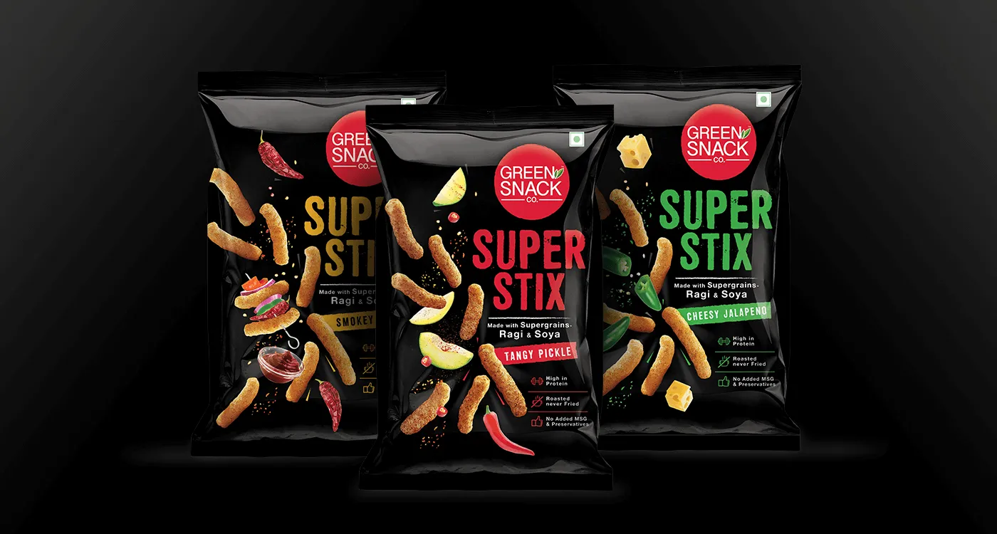
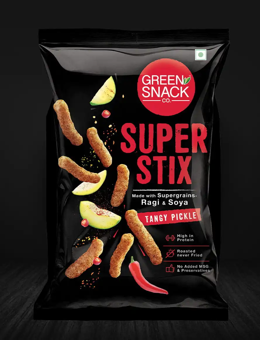
Green Snack Co. (GSC) is a pioneer in the health food and snack category, known for its nutritionally rich offerings. However, as the brand evolved, it began to be perceived as too healthy, expensive, and niche—limiting its appeal among mainstream snack consumers.
The six-grain Stix range needed a complete repositioning to connect emotionally with consumers and expand its reach.

The Challenge
- The category perception of “healthy but boring”
- Snacks being chosen for taste, not nutrition alone
- A product that was nutritionally superior but visually restrained
- Need to make the range feel approachable, exciting, and fun
- Rebrand the same product as Super Stix with a clear taste-first cue
The brief was sharp:
Make it taste-first, not health-first.
The Strategic Approach
Almond Branding reframed the role of healthy snack packaging design from functional communication to emotional attraction.
Our strategy focused on:
- Leading with taste and indulgence
- Retaining health credibility without preaching
- Creating high shelf throw in a cluttered snack aisle
- Making healthy snacks feel bold, modern, and playful


Healthy Snack Packaging Design Solutio
Taste-First Visual Language
The new Super Stix identity flipped category conventions:
- Taste was made the hero, health followed naturally
- The packaging promised “flavour burst”, not restraint
- Visuals were designed to trigger impulse and appetite
This immediately broke the stereotype of dull health snacks.
Bold Typography & Colour Strategy
- Introduction of black as the base colour gave the pack instant dominance and premium attitude
- Bold, confident typography added personality and aggression
- High-contrast pop colours created strong shelf throw and easy flavour differentiation
The pack demanded attention — even from a distance.

Irresistible Snack Visuals
- Dynamic flavour burst shots showcased texture, crunch, and indulgence
- The product was portrayed as fun, energetic, and mouth-watering
- Visual storytelling reinforced that healthy can be tasty too
This helped reposition Super Stix as a snack first, health benefit included.
Clear RTBs & Smart Communication
- Nutritional benefits and multigrain credentials were communicated clearly
- Smart mnemonics and icons simplified information
- Health claims supported the promise without overpowering the taste appeal

The Impact
- Successful repositioning of Super Stix from “only healthy” to “healthy and delicious”
- Stronger shelf visibility in a competitive snack category
- Increased approachability among mainstream snack consumers
- Clear differentiation from typical health snack brands
- A packaging system that balances nutrition credibility with indulgence appeal


Outcome Snapshot
✔ Taste-first healthy snack packaging design
✔ Bold, high-impact shelf presence
✔ Clear health credentials without intimidation
✔ Premium yet approachable brand perception
Almond Branding’s Expertise
This project showcases Almond Branding’s strength in:
- Healthy snack packaging design
- Taste-led FMCG repositioning
- Bold, shelf-dominant visual systems
- Making health brands commercially exciting


