In a category with extreme loyalties passing on through generations, how do we roll out a new brand and yet succeed in a crowded marketplace?
By making your differentiation loud and clear. Simple!
The Differentiated Identity
Identify opportunities for differentiation in the dairy market, starting with an overarching brand concept and fresh Brand Identity. From this high-level view of the current landscape, we had to drill down to the core creative components and brand philosophy we were trying to bring to life through brand positioning, messaging, identity, color and other brand assets.
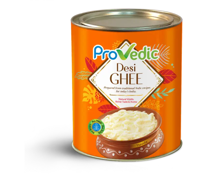
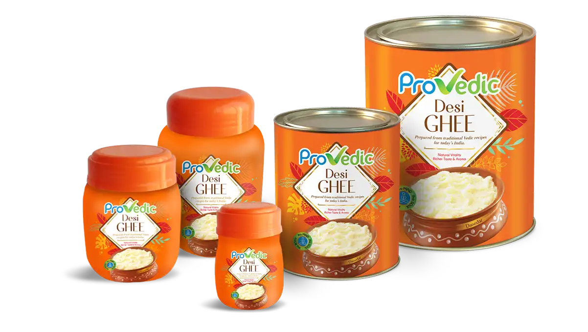
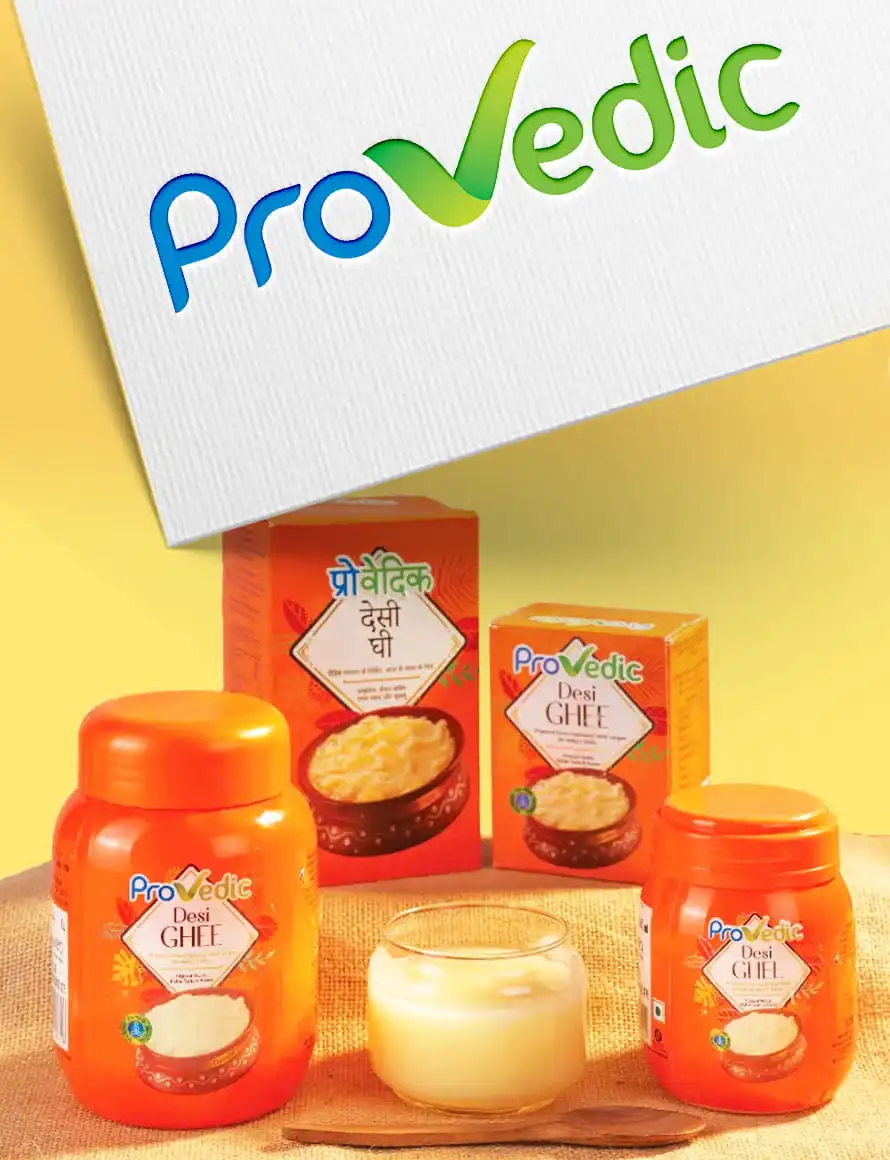
Taking Ghee beyond traditional Cow and farm imagery
Stacks of Ghee jars and tins in the supermarkets. But all with the same flavour, same design codes and same attitude. We saw an opportunity to shake things up.
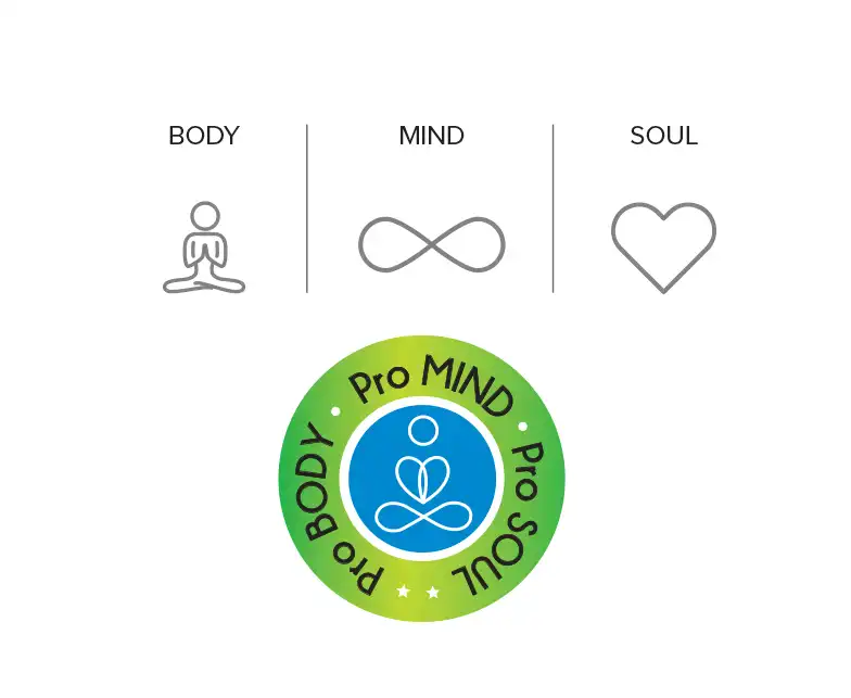
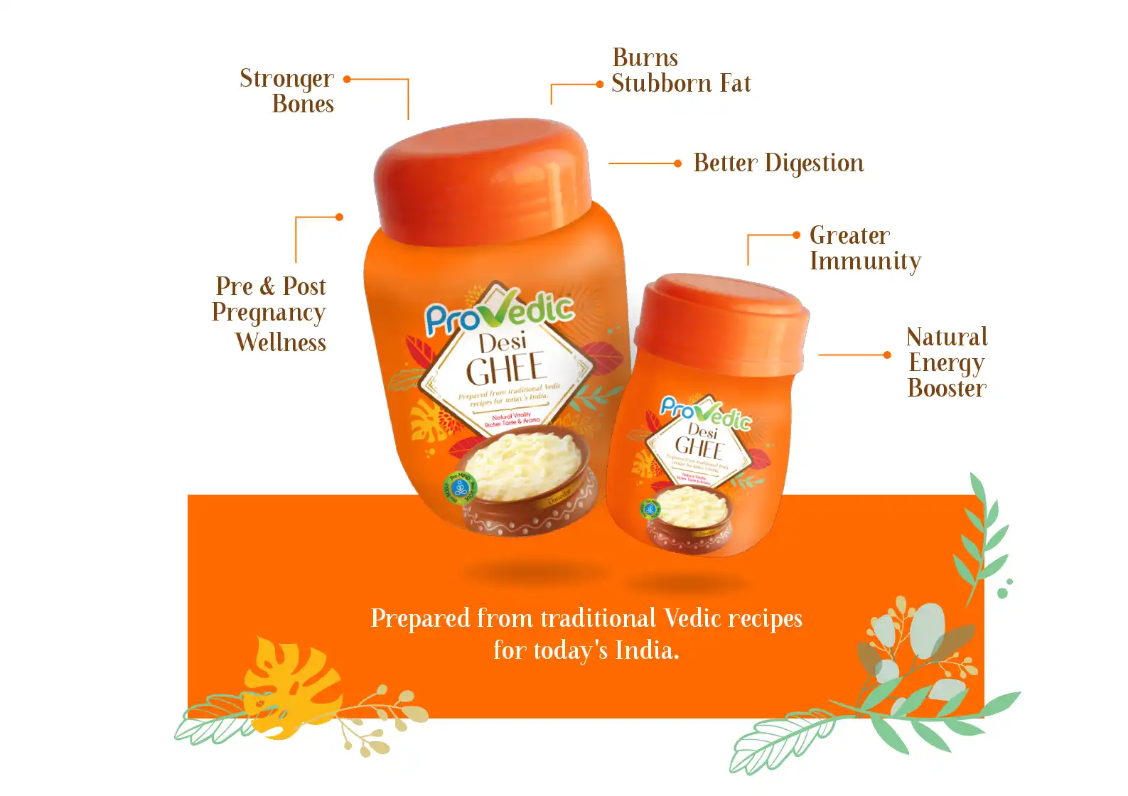
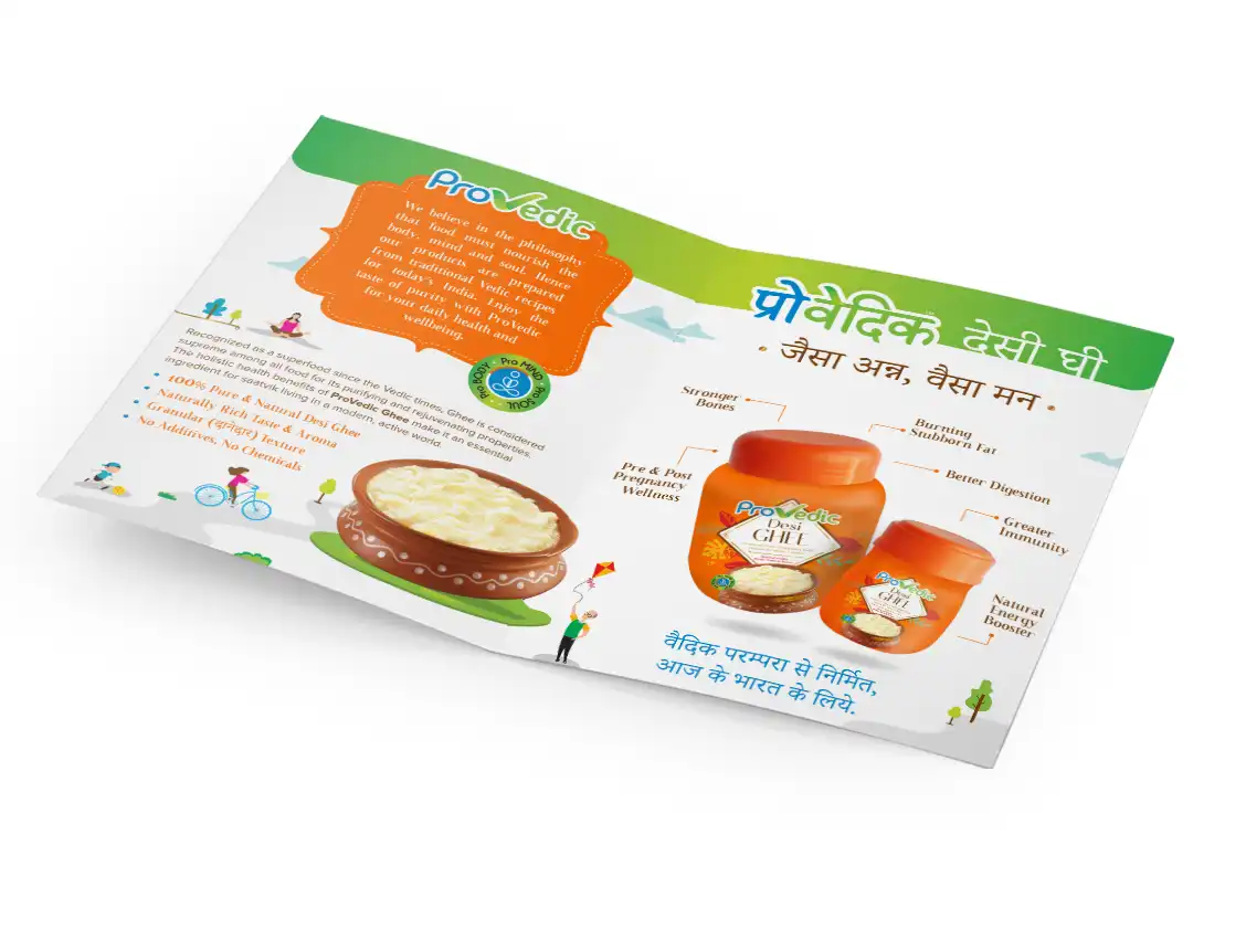
Traditional Vedic recipes for today's India
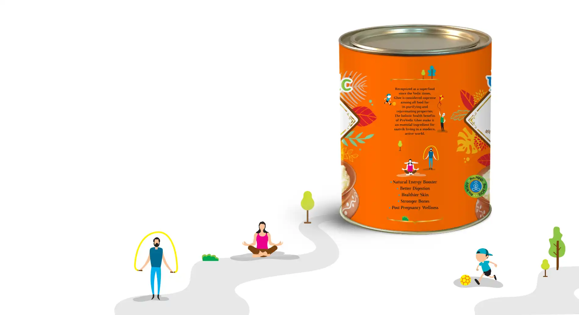
To really emphasise the fact that this was a totally new way to look at Ghee, we championed the idea of ‘Traditional Vedic recipes for Today’s India’ – drawing on ProVedic’s expertise to tell the ‘Taste of Purity’ story that highlighted the product’s holistic health benefits making it an essential for saatvik living in a modern, active world. We crafted a Packaging Design that broke category codes while staying authentically true to the brand.
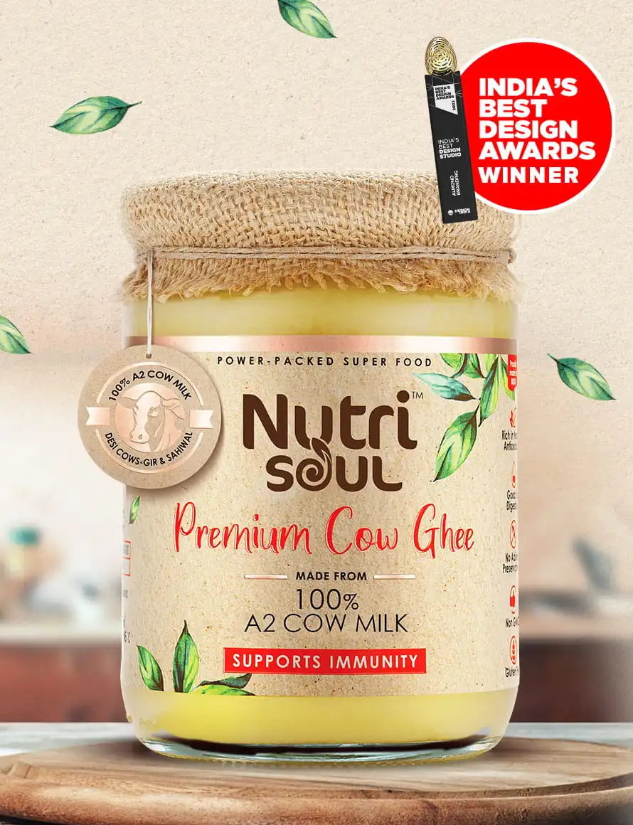
Taste of Purity
We delved into contemporary Health packaging cues and blended it with insights of what consumers expect from the category and how they perceive certain styles.
We delivered a creative solution that really brought this story of saatvic living and purity to life – combining contrasting shapes and colours to give the brand a true sense of originality.
The result is a mix of modern and traditional design that at once feels distinct as well as familiar.
The evolution
The brand continues to evolve as we develop the next phases of the roll out, extending the brand language into Retail Visibility elements, brand collaterals, and web design to help build momentum for this new offering in the dairy aisle.