
Desaal Wine Collection – Premium Wine Packaging Design
The Brief
Desaal Wines planned the launch of a curated collection of premium wines made from select varietals sourced from the Nashik Valley. The objective was to create a premium wine packaging design that glorified geographic origin and winemaking expertise, while appealing to a modern, design-aware Indian consumer.
The packaging needed to strike a balance — contemporary yet classic, expressive yet refined.

The Challenge
As a growing premium wine brand, Desaal needed packaging that could:
· Establish immediate shelf credibility in a competitive category
· Communicate Nashik Valley provenance without appearing dated
· Create a strong premium perception across multiple wine varietals
· Build a cohesive design system scalable for future extensions
The challenge was to tell a regional story through design, without relying on predictable or clichéd visual cues.

The Design Approach
Geography as the Hero
Almond Branding built the packaging concept around celebrating the Nashik Valley through modern illustrative storytelling. Instead of literal visuals, abstract valley and vineyard-inspired illustrations were crafted to represent the region’s character and richness.
This approach allowed the brand to communicate origin while maintaining a contemporary, premium aesthetic.
A Distinct Premium Visual Language
To elevate the brand’s shelf presence, we developed a refined visual system:
· Deep textured black backgrounds to anchor premium positioning
· Vibrant illustrative elements to add freshness and distinction
· Clean, confident typography for clarity and sophistication
· Thoughtful detailing to enhance tactile and visual appeal
The result was a packaging design that feels timeless yet modern.

Variant Differentiation with Consistency
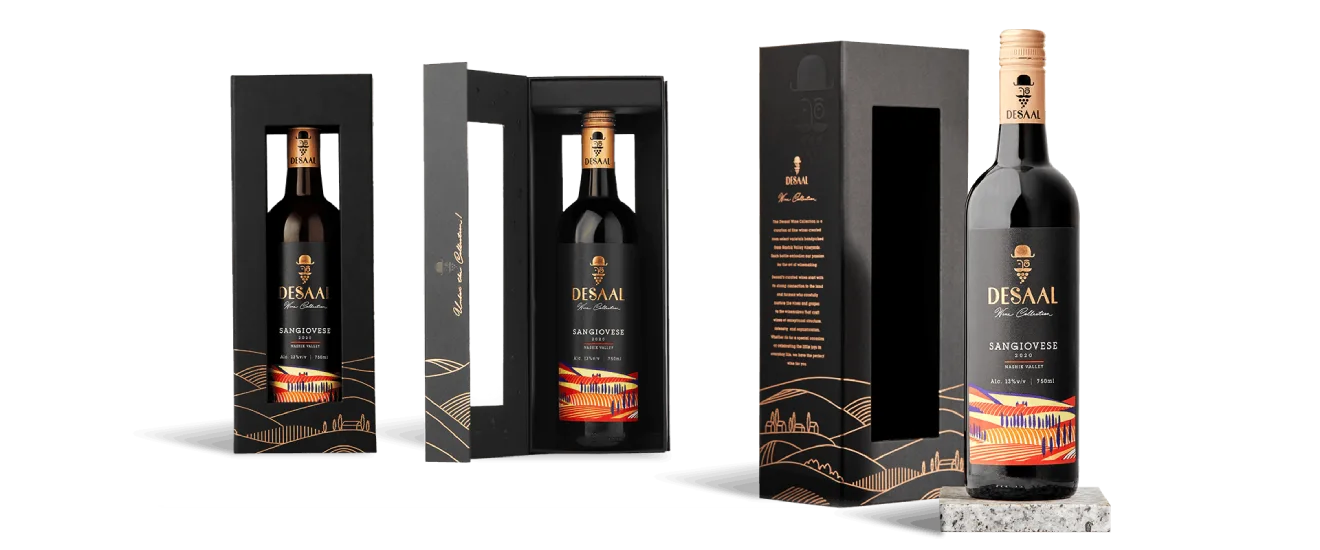
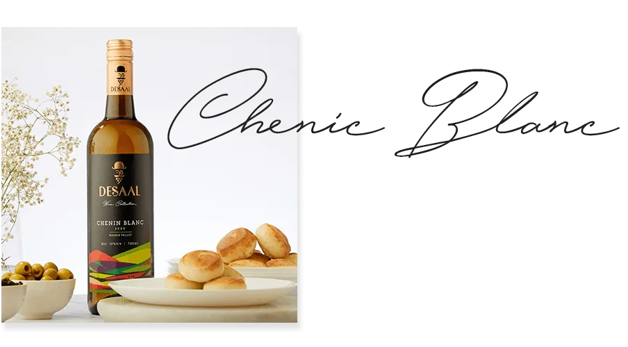
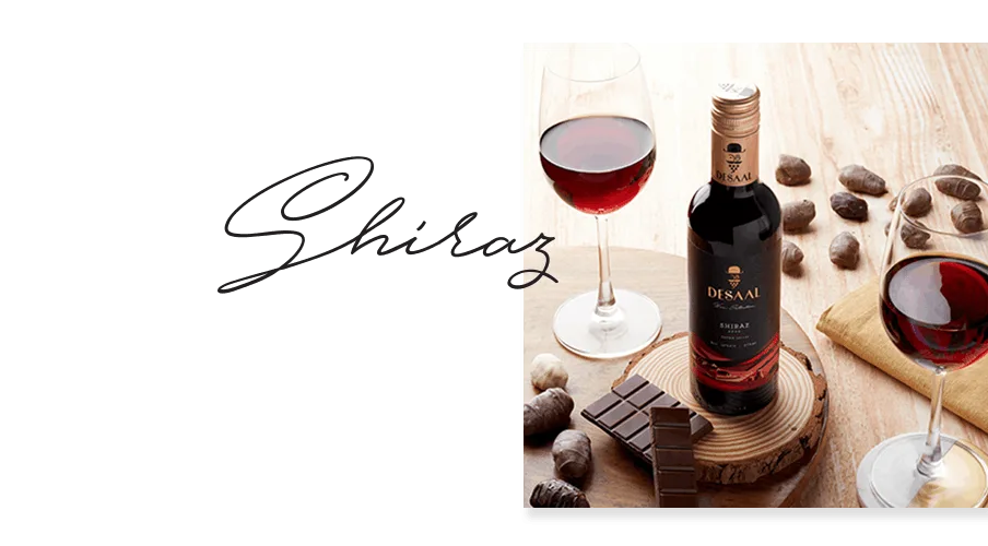
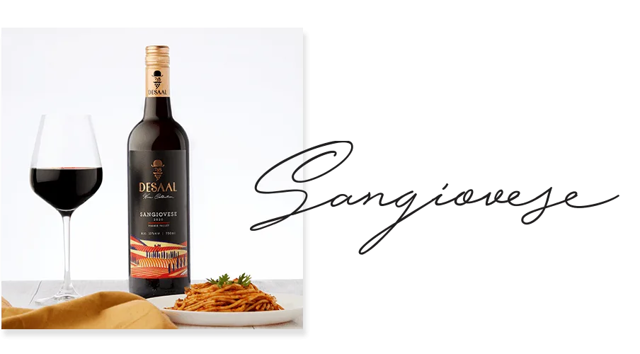
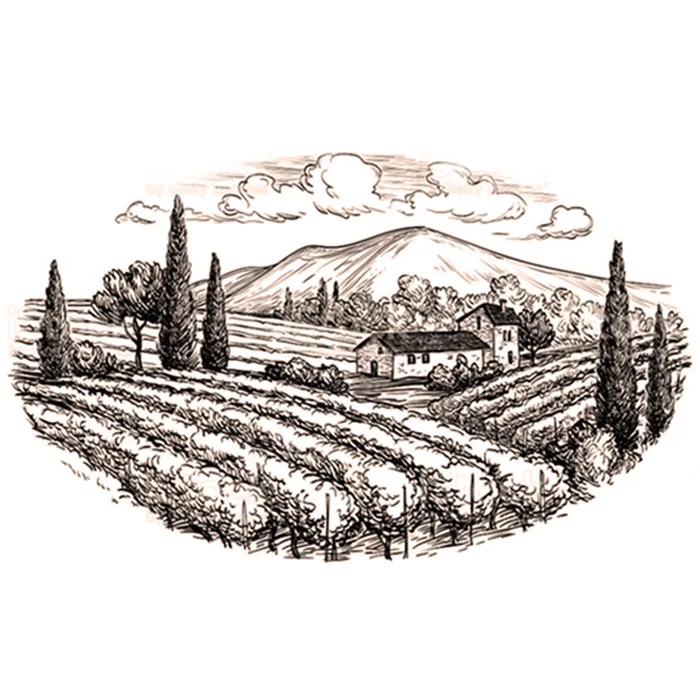
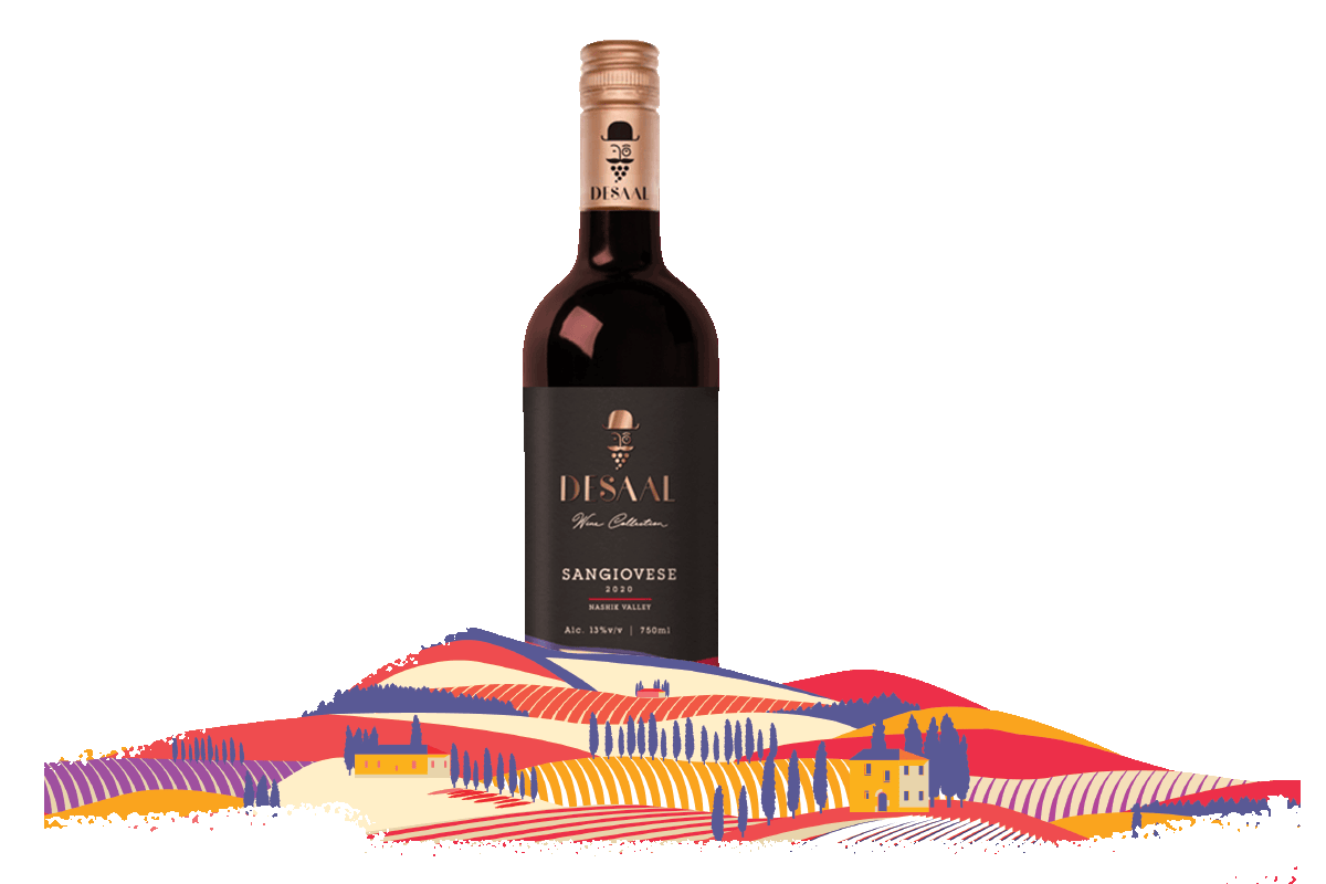
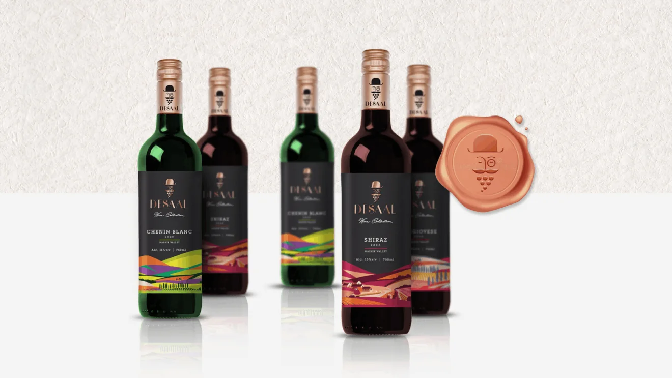
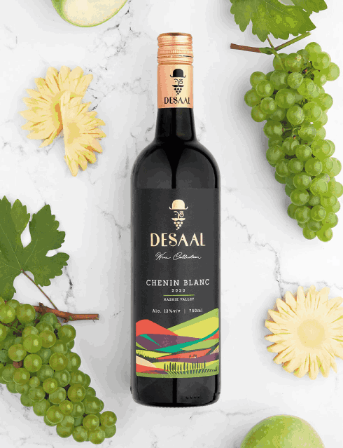
Each wine variant — Chenin Blanc, Sangiovese, and Shiraz — was given its own illustration style
derived from the same Nashik Valley visual framework.
· Clear differentiation for easy consumer navigation
· Strong consistency to build brand recall
· A scalable packaging architecture suitable for portfolio growth
As a collection, the bottles look unified. Individually, they retain their own character.
Extending the Story Across Touchpoints
The design language was extended seamlessly across bottle labels and outer packaging,
ensuring the Nashik Valley origin story remains visible across retail, gifting, and display formats.
Every element reinforces Desaal’s commitment to craftsmanship and premium winemaking.

Impact
The new wine packaging design helped Desaal Wines:
- Establish strong premium shelf presence at launch
- Build immediate credibility as a modern Indian wine brand
- Communicate regional provenance in a refined, contemporary manner
- Create a packaging system ready for future varietal extensions

Outcome Snapshots
- Premium visual identity aligned with modern wine consumers
- Distinct yet cohesive multi-variant packaging system
- Strong balance of classic wine cues and contemporary illustration
- Packaging that supports brand storytelling beyond the bottle
Almond Branding’s Expertise
This project showcases Almond Branding’s strength in
- Premium wine packaging
- Alcohol brand storytelling
- Luxury visual identities
- Print and finish mastery
- Portfolio-ready pack architecture


