

Bread Packaging Design That Makes the Butter Story Impossible to Miss
The Brief
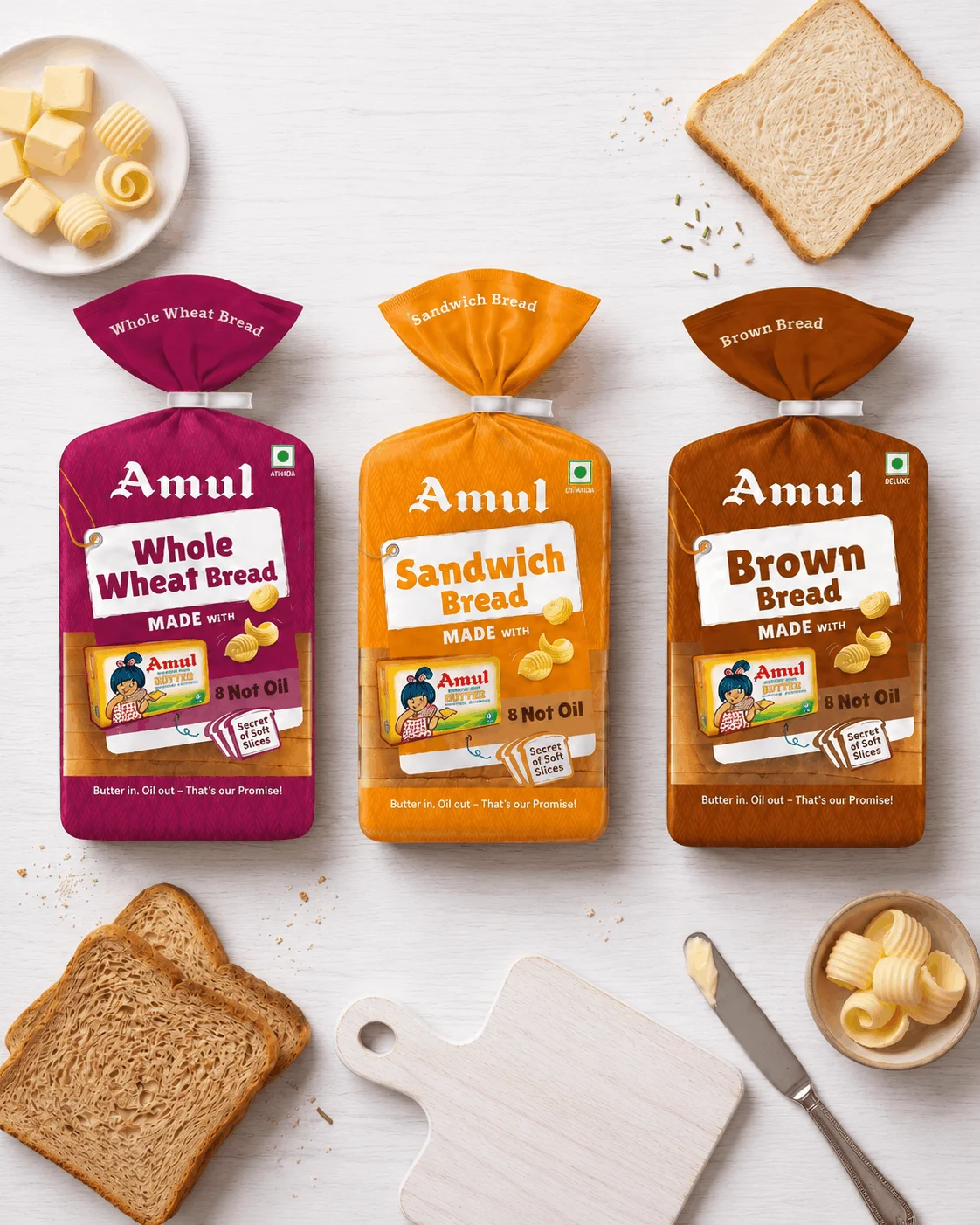
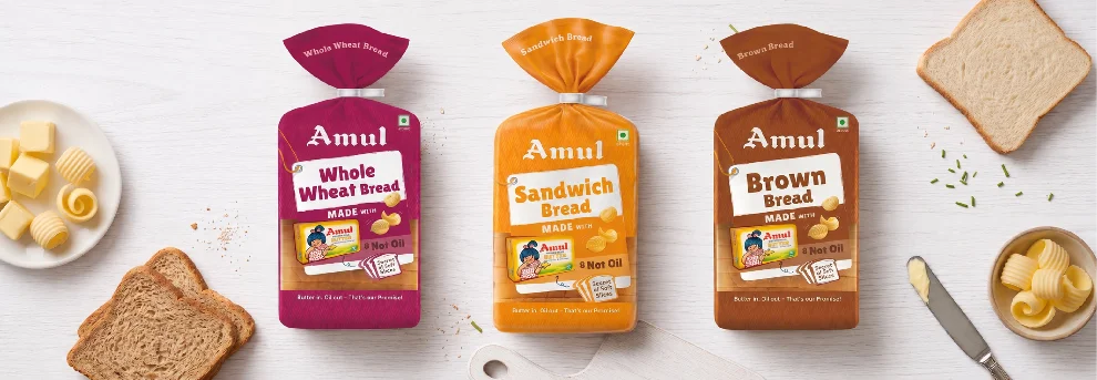
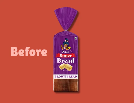
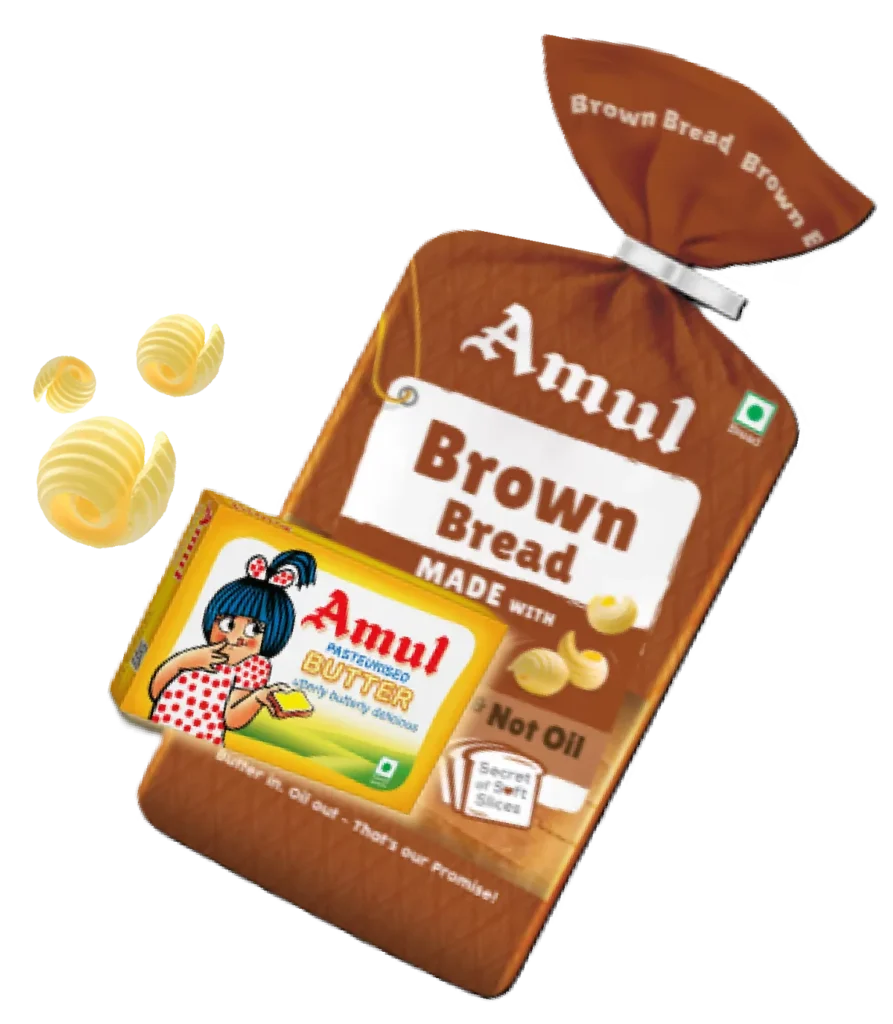
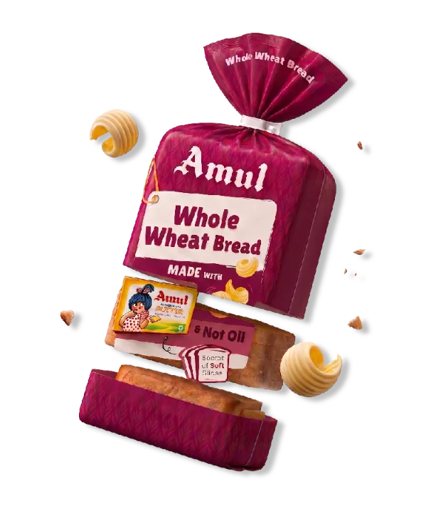
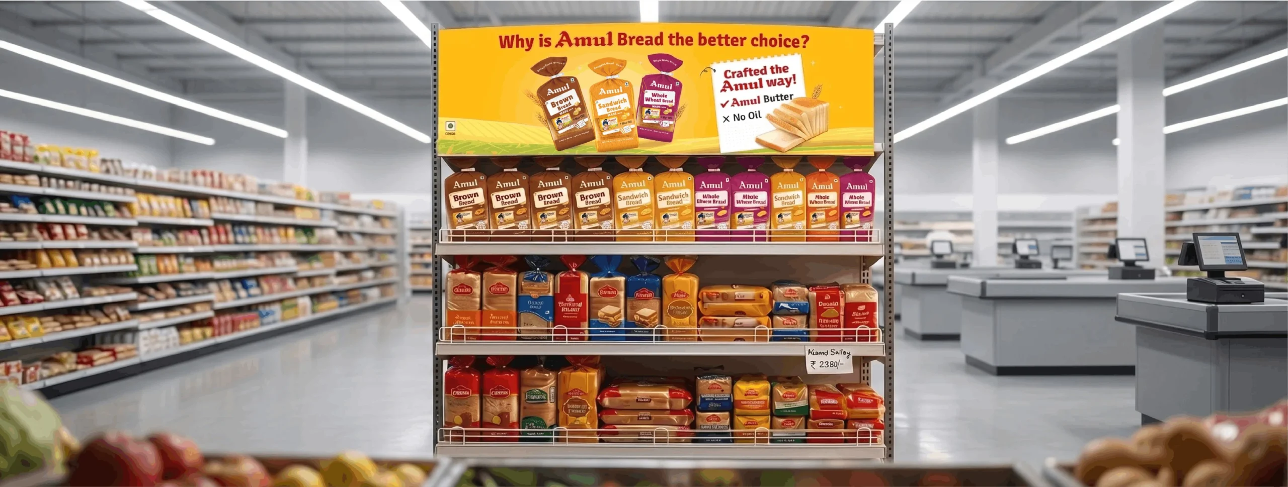
In a highly commoditised category like bread, differentiation is everything. Despite being baked with Amul Butter, the existing packs failed to communicate this powerful advantage.
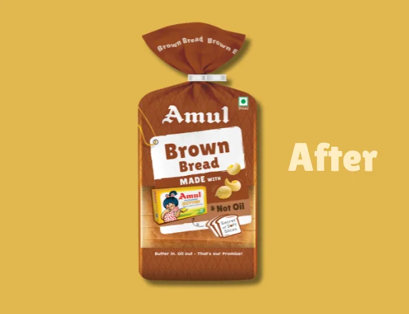
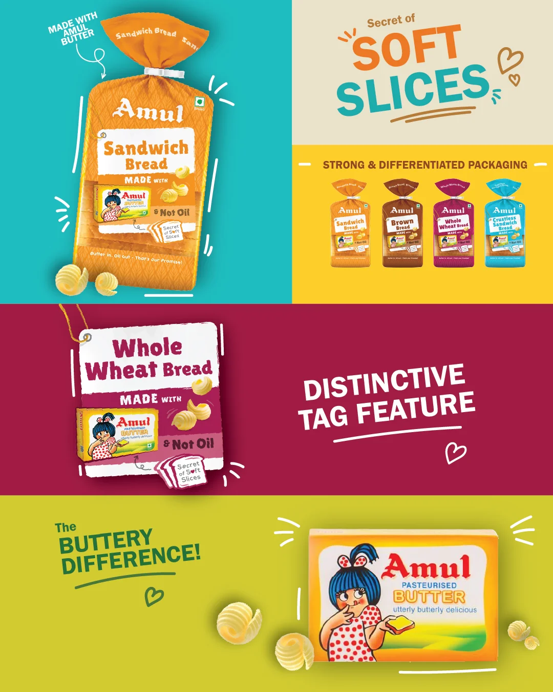
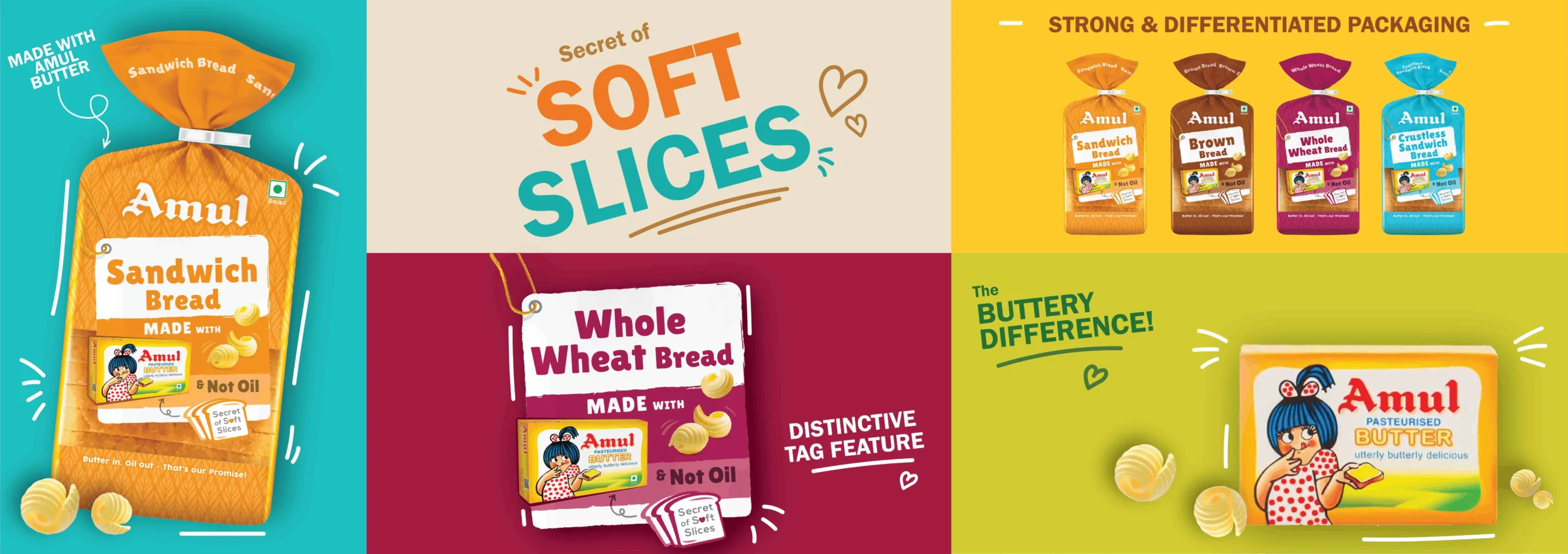
Almond Branding was tasked with a strategic bread packaging design revamp to:
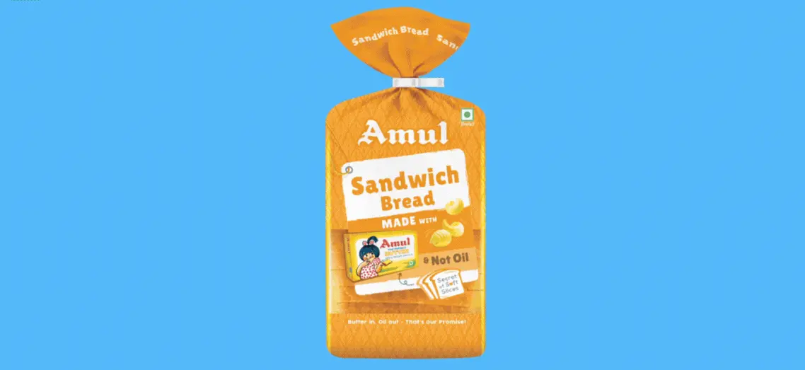
- Clearly highlight that the bread is made with Amul Butter, not oil
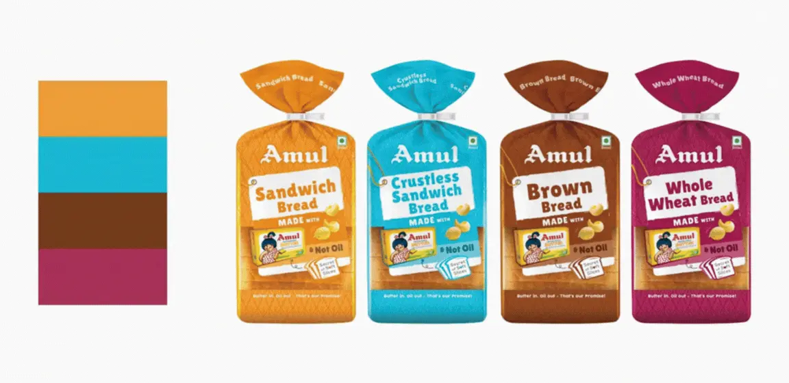
- Create strong differentiation in a cluttered FMCG packaging design landscape
- Strengthen association with the iconic Amul Butter brand
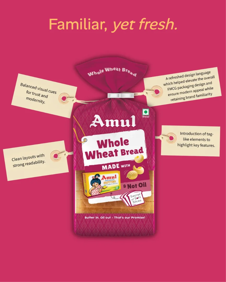
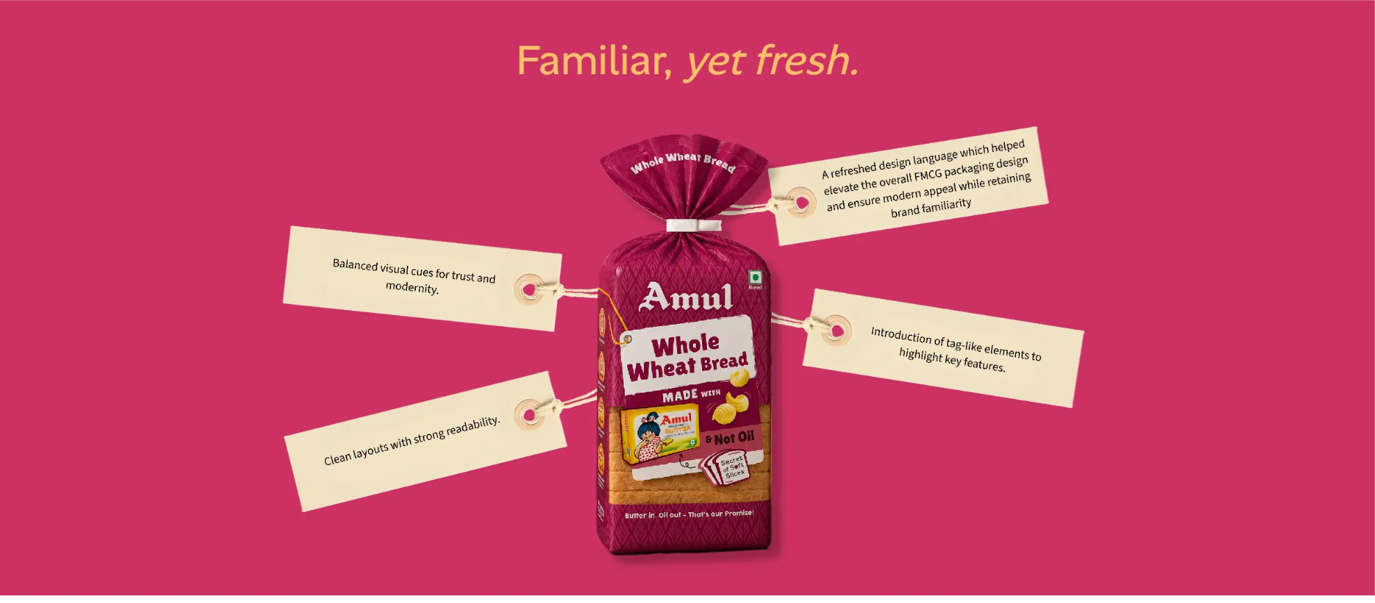
- Modernise the packaging while retaining familiarity and trust
- Improve navigation through a clear packaging design system
The goal was simple yet powerful — make Amul Bread feel like the obvious upgrade.


The Challenge
A Superior Product Lost in a Commodity Category
The product had a strong inherent advantage — softer texture and richer taste due to butter.
However:
- The butter advantage was invisible on shelf
- Packaging blended into a sea of functional, price-led competitors
- Oil-based breads were aggressively marketed but looked similar
- The brand’s credibility wasn’t translating at the point of sale
The challenge was not product quality — it was perception.
The task was to transform perception through food packaging design that makes the superiority instantly visible.
The Strategy
From Hidden Benefit to Hero Story
The core shift was in visual hierarchy in packaging.
Instead of letting “Butter Bread” get lost, the structure was flipped:
- Product first (Bread Variant)
- Followed by a bold, unmistakable claim:
“Baked with Amul Butter. Not Oil.”
This ensured that the key differentiator becomes impossible to miss.
The Solution
Amul Butter as the Hero
The most powerful move in the bread packaging design was making butter visible.
- The iconic Amul Butter pack was placed directly on the packaging
- Instantly signalling quality, taste, and trust
- Creating a strong mental shortcut for consumers
This turned an ingredient into a visual proof point.

DIRECT CONSUMER MESSAGING
Clear, bold claims were used to educate and differentiate:
- Zero Oil
- Not Oil
- No Added Palm Oil
These were made highly visible to create immediate contrast against competitors.
This approach strengthened the consumer-friendly packaging and improved decision-making at shelf.


Transparency Builds Trust
A transparent window was introduced — a powerful and proven retail packaging design cue.
- Allows consumers to see the actual product
- Reinforces freshness and authenticity
- Builds immediate trust at the point of sale

Clear Variant Architecture
A strong packaging design system ensured clarity across the range.
- Distinct colour coding for variants
- Improved hierarchy for easy navigation
- Consistency across SKUs
This made the range more intuitive and not only shelf-friendly but thumbnail-friendly for quick commerce.

Visual Architecture
The visual architecture was designed to clearly define what remains constant and what changes across the range.
- Core brand and butter story remain dominant
- Claims and product messaging hold strong visual weight
- Variant colours and identifiers change systematically
This structure ensures:
- Strong shelf recognition
- Easy identification among q-comm clutter
- Consistent brand recall


The Impact
- Transformed a commodity product into a premium offering
- Made the butter advantage instantly visible
- Improved shelf(and thumbnail) differentiation in a cluttered category
- Strengthened brand perception and trust

Outcome Snapshot
- Transformed a commodity product into a premium offering
- Made the butter advantage instantly visible
- Improved shelf(and thumbnail) differentiation in a cluttered category
- Strengthened brand perception and trust
Almond Branding’s Expertise
- Bread packaging design
- FMCG packaging design
- Packaging design revamp
- Visual architecture systems
- Consumer-first packaging


