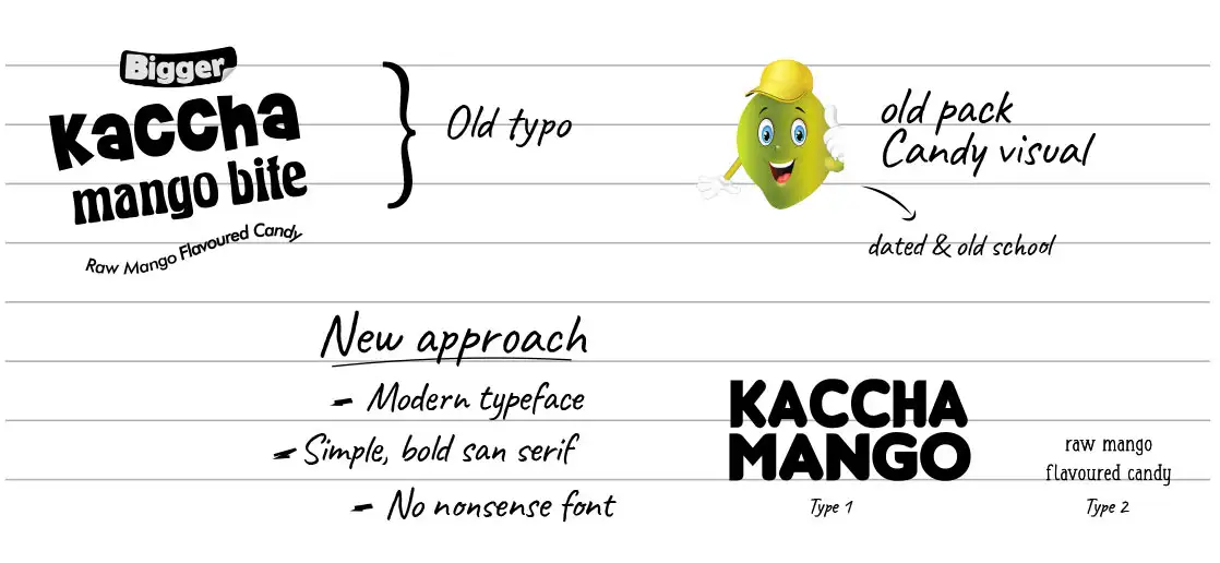
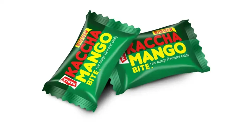
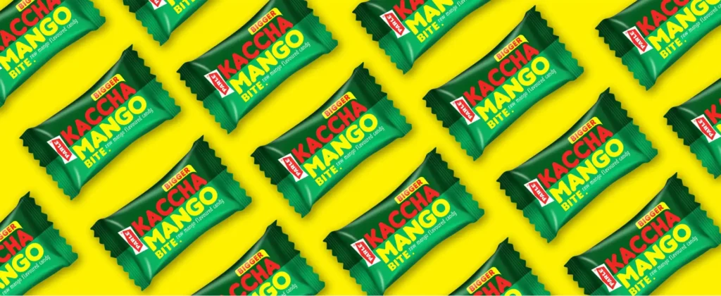
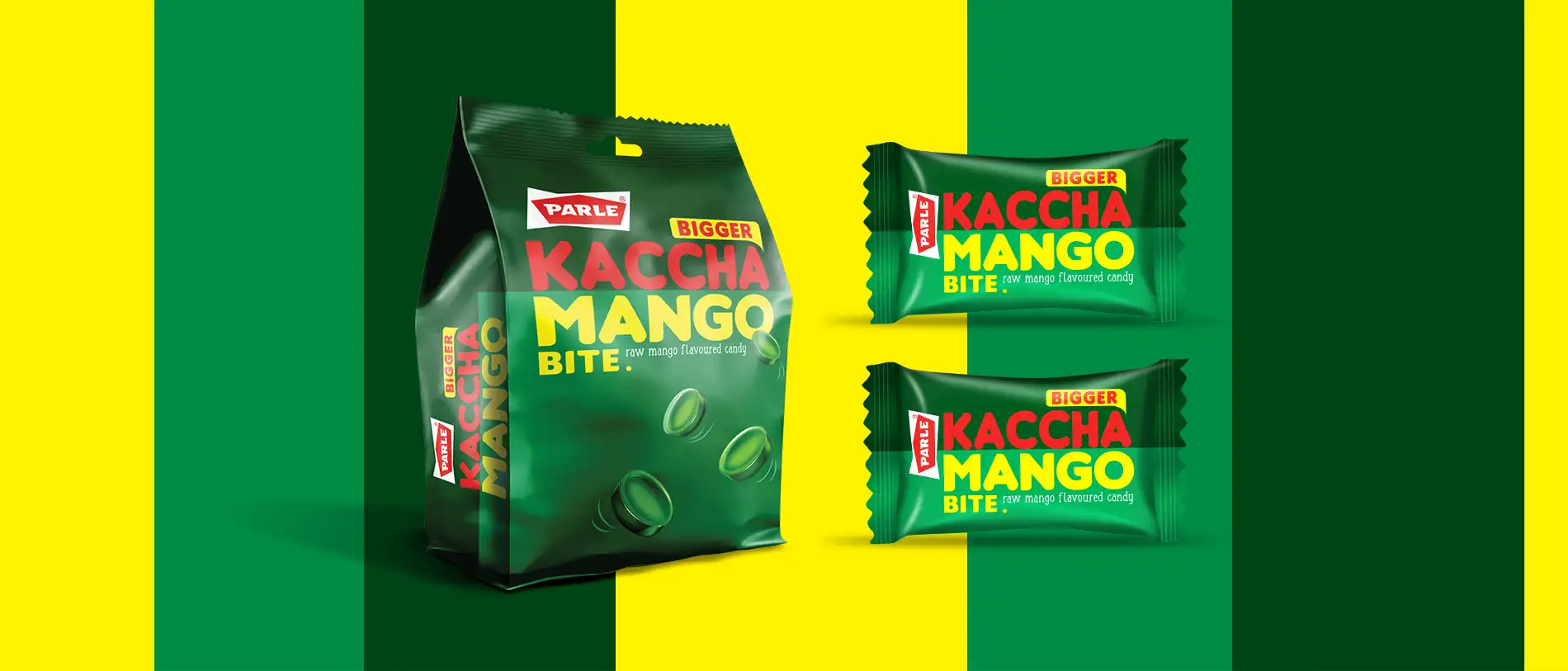
The Semiotics of Raw Mango
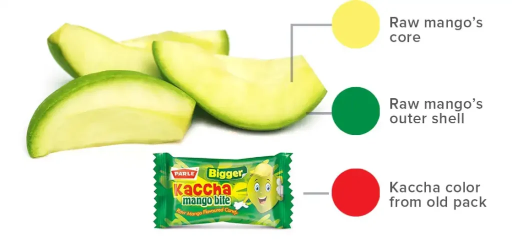
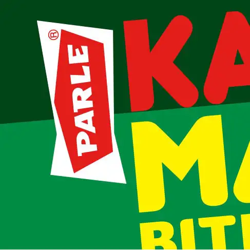
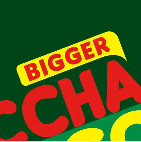
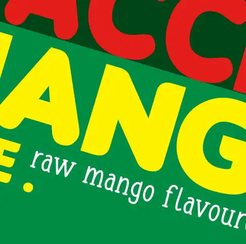
Green is a definite category code signifying the tangy raw-mango flavour. Two different shades of green inspired from the raw mango fruit itself is used as the backdrop. However, the Raw Mango also has a lemony green shade associated with its core that is added to the colour pallette of the Brand. The bright red for “Kachha” was retained. A key insight about the way the loyalist consumers call out this brand and also the fact that raw mango flavour is the chief driver for the purchase, led Almond Branding to propose a change in the weightages of the nomenclature. While “Bite” is made smaller, “Kachha Mango” is highlighted and given centre-stage on the pack.
The Stance of a Market Leader
Over the years, the target group for this category has gradually shifted from 8-14 year olds to younger adults. The design language of the brand had to hence evolve with the emerging design trends. Necessary changes were done in the design, retaining the essence of the brand.
The consumer has evolved over the years and doesn’t need an idiot-proof candy image to be shown on the pack. Hence, it was proposed to break the rules of the game and try something new that is commensurate of the leadership position of Parle in the market. Hence, there are no additional elements distracting the eye or clouding the message. The outcome is a simple smart and modern packaging which oozes out the bold attitude of the consumer it appeals to
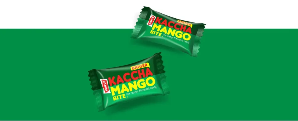
The Uplifted Imagery
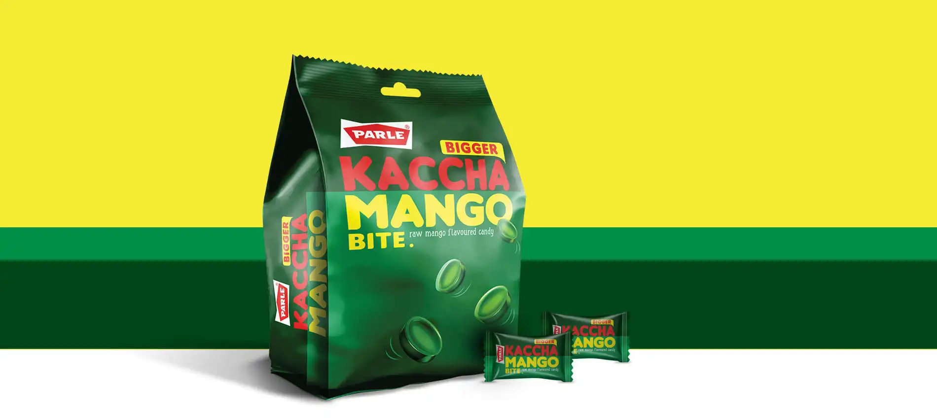
This is it’s first-ever revamp since the product was launched in 2004 and intends to create the required connect with the target audience on a broader spectrum, positioning itself yet again as the market leader in the category.
The product is now made to look even more premium by leveraging the existing equities of the brand to showcase a youthful and aspirational imagery.