
MILMA – Brand Identity & Packaging Revamp for Kerala’s Iconic Dairy Brand
The Brand Context
Milma is one of Kerala’s most trusted dairy brands — backed by the Government of Kerala and loved for its quality for over four decades. However, despite strong equity, extensive consumer research revealed a critical challenge: the brand was no longer perceived as young, vibrant, or relevant to new-age consumers, especially the youth
At the same time, inconsistent branding and packaging execution across Kerala’s three milk unions had diluted brand clarity and recall.
The Challenge
- A 42-year-old legacy brand losing relevance among younger consumers
- Low recall for new-age product categories
- Inconsistent packaging and brand imagery across regions
- Need to modernise without losing trust and familiarity
- Requirement to unify branding under “One Taste. One Quality. One Brand.”
Milma needed a brand identity revamp that respected its legacy while making it feel contemporary, cohesive, and future-ready.

The Strategic Approach
Almond Branding was entrusted with a high-stakes mandate: Make a 42-year-old brand feel 24 — without breaking trust.
We began with deep market, consumer, and competitive analysis to understand Milma’s existing equity and future growth drivers. The strategy focused on:
- Retaining familiarity while injecting freshness
- Creating a unified visual identity system across the state
- Enhancing shelf impact and brand recall
- Making the brand culturally rooted yet visually modern
The revamp was prioritised across Milma’s top three revenue-driving products — Milk, Ghee, and Curd, contributing to 97% of overall sales

The Design Solution
A Unified Visual Identity System
A strict visual architecture was created to bring consistency across all SKUs and regions. The central visual device drew inspiration from the holy cow, symbolising care, nourishment, and respect for values — a core pillar of Milma’s philosophy
- A benevolent cow visual looking back at the consumer
- A smart sensorial unit representing taste and aroma
- Clean, minimal layouts to communicate freshness and purity
Strategic Packaging Design
- Existing milk colour codes were retained to aid quick early-morning purchase decisions
- Curd packs introduced vibrant backgrounds to differentiate from milk SKUs
- Milma Ghee retained its iconic red while introducing golden-yellow cues to highlight purity
- Malayalam tagline reinforcing trust and emotional connect was retained across packs
The result was packaging that felt premium, modern, and cohesive, yet unmistakably Milma.

The Impact
The revamped brand identity and packaging delivered immediate results:
- Strong positive response from consumers across age groups
- Significant improvement in shelf visibility and brand recall
- Renewed appeal among younger consumers
- Consistent branding across Kerala for the first time
- A brand that felt modern, confident, and future-ready — without losing its roots
Milma emerged as a brand that successfully blended legacy with modernity, ready to face new market entrants with confidence.
Outcome in a Snapshot
✔ Reduced perceived brand age
✔ Unified statewide brand imagery
✔ Improved youth relevance
✔ Stronger shelf presence
✔ Scalable packaging system for future SKUs
Almond Branding’s Role
This project stands as a testament to Almond Branding’s expertise in:
- Iconic brand revamps
- FMCG branding and packaging design
- Balancing heritage with modern relevance
- Strategic visual identity systems at scale


Packaging Design Realignment
Since the product portfolio had grown organically over the years, there was no cohesive thought, nor standardised messaging hierarchy or unified tone of voice across the existing packaging.
Though quite effective individually as efficacious products, there was no unified brand equity being built on the shelves due to lack of uniformity in packaging design. Packaging design realignment was the obvious next step.


The News

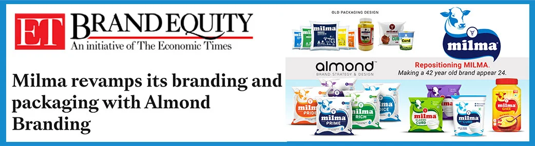
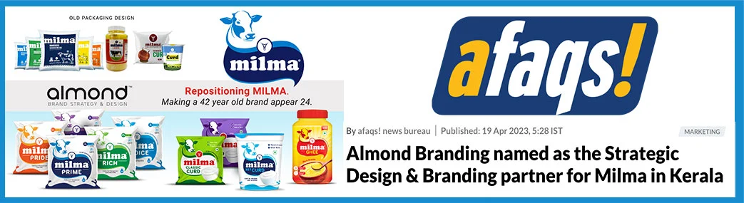
I would like to extend my sincere appreciation for the strategic branding support Almond Branding had provided Milma during our repositioning journey. Almond Branding's creative insights, design thinking and deep understanding of our brand ethos have played a vital role in refreshing Milma’s identity and aligning it with the evolving aspirations of today’s consumers. The team’s dedication, responsiveness and collaborative approach have been commendable throughout the process.
Shreejith Nair
Marketing Head, Milima


