Taking an innovative product from idea to shelf
Taking an innovative product from idea to shelf
Nihar Extra Care Hairfall Control Oil
ClientMaricoCategoryBeauty & Personal careServicesBranding | Packaging Design
Packaging a Product Innovation
In its journey of modernizing itself, Nihar intended to introduce a new variant: Nihar Naturals Extra Care Hair fall control oil - a light oil, a problem solution yet a premium variant. The objective was to cater to the unmet need of the younger, modern women who is faced with the challenges of hair fall due to the lifestyle changes that she is going through. Almond Branding was brought on board to help craft the Packaging Design.
Packaging Inovation
The new variant in itself was pegged to be one of the most innovative products ever launched by Marico. It had a potent mix of 5 seeds within the cap that would enrich the oil every time it’s poured. Our task was to compliment the packaging innovation, through the mode of design and convey the uniqueness of the product.
Appealing to the Modern Woman
The audience we were dealing with, was smart, young girls aged 25-30yrs, who are aspirational, ambitious and achievement-oriented.She believes in the inherent goodness of coconut oil but she wants something more than the base oil – Extra Care. She is looking for a modern and progressive product with superior sensorials that can provide her a solution to her modern-day hair health concerns, primarily hair fall.
Almond’s approach was to create a Brand Design that can portray the same image of confidence and success that this multifaceted modern woman aspires to have.
Using its ethnographic research tools, Almond Branding explored the category’s trends and benchmark brands to understand and define the opportunity. Nihar’s strong hair-care credentials gave it a robust platform to launch a higher-end problem-solution alternative, and its progressive stance lent the brand the desired attitude. By evolving the hair oil category, Nihar could steer its away from mainstream mediocrity.
The Semiotics of Nourishment
The team at Almond derived a semiotic understanding of the category to decode the deeper belief system of nourishment through hair oils and their meaning in the consumers’ lives.
A stylized golden drop filled with the unique ingredients – the 5 seeds, captured the potency that every drop of this oil promises to have.
A consumer insight that each hair follicle should receive the nourishment from root to tip led us to incorporate an elegant follicle framing the drop that depicts the essence of the unique product.
To make the seed story un-missable on the pack, and also so that consumers can identify each of the seeds, also visible on the cap, the same were repeated in 5 roundels below the oil drop.
It was imperative to drive home the fact that the seeds would be increasing the potency of the oil every time oil enters the cap on tilting, the bottle. To connote this nutritive action, a term “Activ-Seeds” was coined by Almond that was later trademarked by Marico.
The Premiumness Quotient
To add to the premiumness quotient, gold was used optimally on the pack - right from the golden foil on the cap to highlighting Activ-Seeds to the thin design elements of the Visual Hook.
To highlight this as the premium most variant from the Nihar family, there was a touch of gold added to the logo as well. With this simple tweak in the logo, Nihar made its way up into the premium category of hair oils.
To stay closer to family, the green brand colour was maintained, but was transformed into a much more fresher shade. A tinge of yellow was added from bottom, whereas transparency was retained in the middle to connote light hair oil.
Premium most cousinof the family
Premium most cousin of the family
Retail Visibility
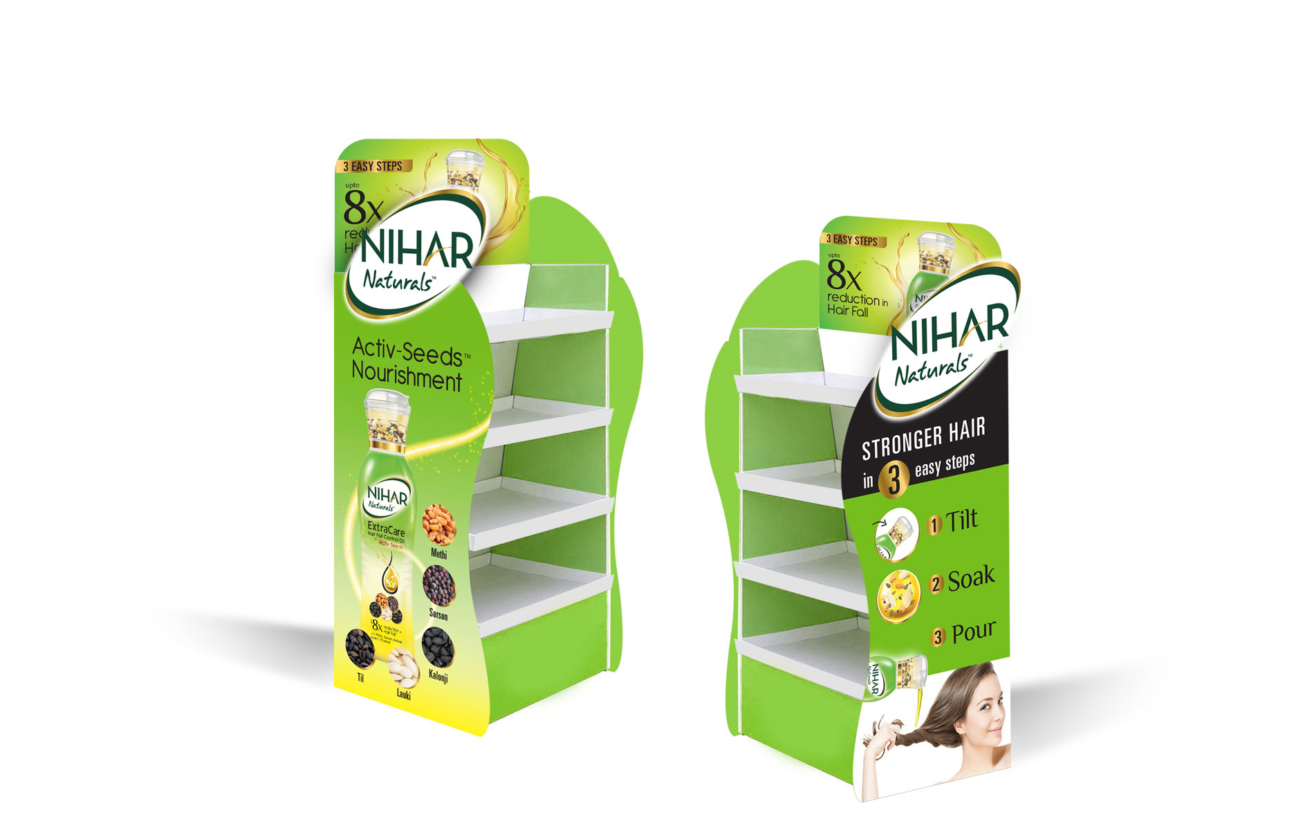
For the Packaging Innovation to have the maximum impact at the retail shelf level. Almond proposed to have a neck tag that would direct the focus towards the cap, where the uniqueness of the product dwells.
Since the product was innovative, the usage pattern was a little different from regular hair-oils. We built a 3-step ritual that would imbibe the new process into the daily habit of our consumer.

