4PM Bar – Nutrition Bar Packaging Design & Startup Branding
CLIENTNaka Foods
CATEGORYFood & Beverages, Health & Wellness
SERVICESBrand Identity | Packaging Design | Communication Design
SHARE
The Brief
4PM Bar was conceptualised as a modern nutrition bar brand targeting young, urban consumers looking for a healthy yet indulgent snacking option during their daily energy dips — especially around the mid-day 4PM hunger window.
As a startup, the brand needed a strong nutrition bar packaging design and identity system that could stand out in a cluttered health snack category while building instant relatability and recall.
Almond Branding was entrusted with creating a complete startup branding and packaging solution — from brand identity to packaging — that could make 4PM Bar feel bold, youthful, and impossible to ignore.
The Challenge
The brand had to break through multiple category barriers:
· Health snacks often feel boring, serious, or overly functional
Nutrition bars are typically perceived as bland or only for fitness enthusiasts
Strong competition from established protein and snack brands
Need to appeal to both health-conscious and taste-driven consumers
The challenge was to create a health food packaging design that makes nutrition feel exciting, approachable, and everyday.
The Brand Idea
Owning the 4PM Hunger Moment
The core insight was simple yet powerful — everyone experiences a hunger pang around 4PM.
The brand was built around this universal moment, making it instantly relatable and memorable. 4PM Bar became not just a product, but a solution to a daily craving.
The Design Approach
Breaking the “Healthy = Boring” Code
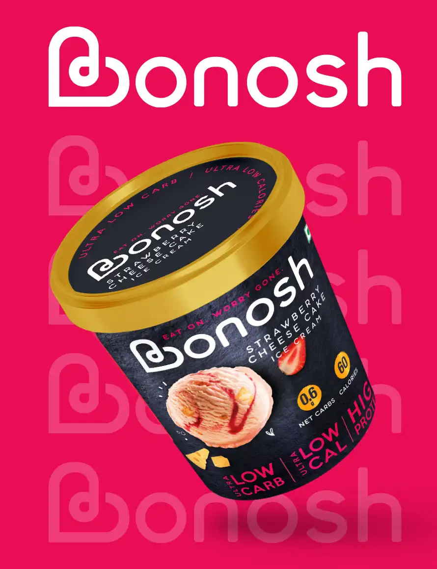
The nutrition bar packaging design was developed to disrupt category conventions.
Instead of muted, clinical packaging, the design embraced:
Bold colours
High-contrast typography
Energetic visual language
This helped reposition the product as a fun, lifestyle snack, not just a functional health bar.
Bold & Youthful Packaging Desig
The packaging was crafted to appeal to modern consumers:
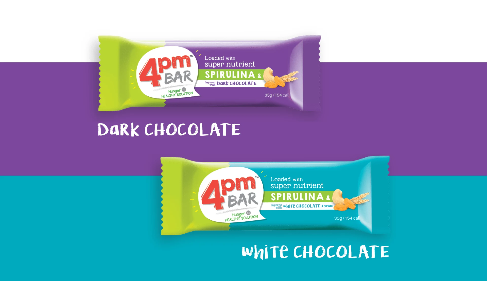
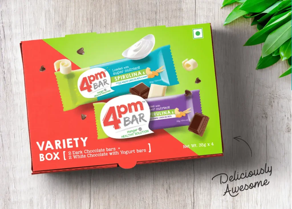
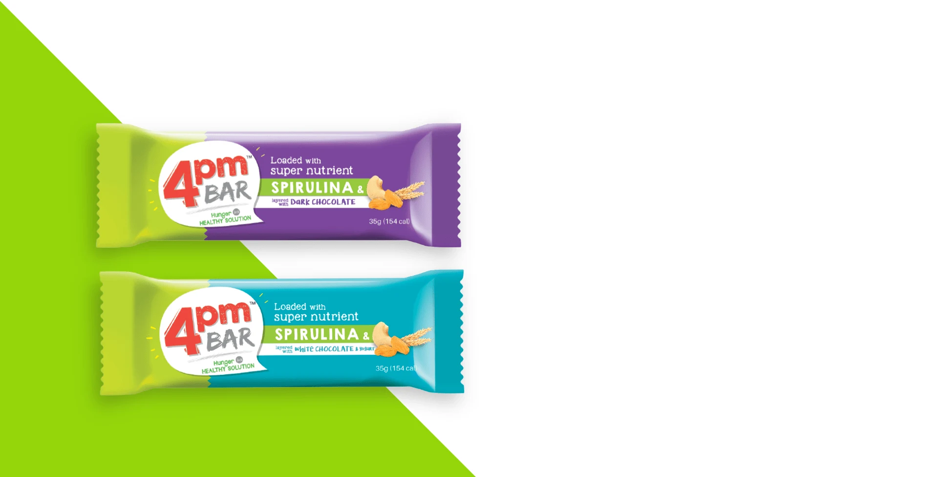
Vibrant colour palettes for each variant
Strong, playful typography for brand recall
Clean yet energetic layouts for instant readability
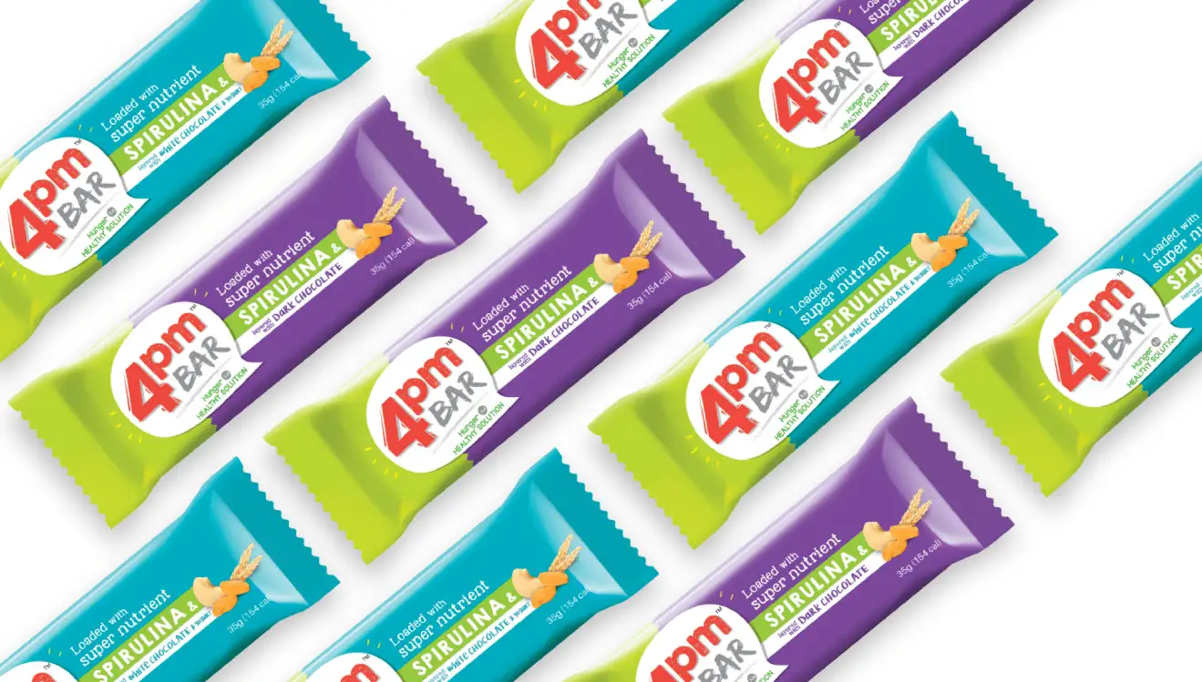
This snack packaging design ensured the product stood out both on shelves and in digital environments.
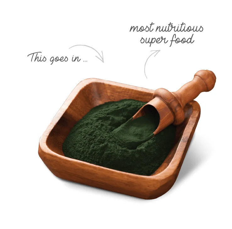
Protein & Energy Positioning
While the design leaned toward fun and relatability, it did not lose sight of functionality.
Clear communication of nutrition benefits
Easy-to-read cues for protein and energy value
Balanced messaging between taste and health
This made the protein bar packaging design both aspirational and informative.
Designed for D2C & Retail
The packaging was optimised for both modern retail and digital-first consumption:
High visibility in crowded shelves
Thumbnail-friendly design for e-commerce platforms
Consistent brand identity across touchpoints
This ensured strong performance as a D2C food brand packaging system.
Impact
Successfully positioned 4PM Bar as a relatable, everyday snack
Broke the stereotype of boring health food packaging
Built strong brand recall through a time-based identity
Created high visual differentiation in a competitive category
Outcome Snapshots
Bold, high-impact nutrition bar packaging design
Youthful and relatable brand identity
Strong shelf and digital visibility
Scalable system for multiple variants
Almond Branding’s Expertise
Nutrition bar packaging design
Startup brand creation
D2C packaging systems
FMCG snack branding
Bold brand identities
What Founder had to say
The team is highly creative and spends good time in understanding the product and researching the space. The variety in approach and their flexibility in work is really impressive.