GUUD – Health Food Packaging Design & Wellness Branding
The Brief
Patrika Group, one of India’s leading media houses with a turnover of over ₹3000 crores, set out to diversify into the health and wellness space with a bold vision — to transform how India consumes by enabling better food and beverage choices.
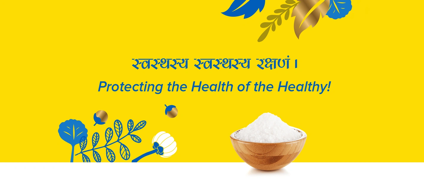
This led to the creation of Patrika Wellness, built on the philosophy of ‘स्वस्थस्य स्वस्थस्य रक्षणं’ — protecting the health of the healthy.
The first step in this journey was addressing one of the most common lifestyle concerns — excessive consumption of white sugar. The answer was a new range of value-added sugars and sweeteners, requiring a strong health food packaging design and brand ecosystem.
Almond Branding was brought on board for complete startup branding, including brand architecture design, Logo Design, Visual Identity and sugar & sweetener packaging design.
The Challenge
Making Health Simple, Scalable & Premium
The challenge was multifold:
- Build a wellness brand from scratch for Indian and global markets
- Simplify complex health benefits for everyday consumers
- Create health food packaging design that justifies a 5–6X premium pricing
- Design a system that works across multiple price tiers (mass to premium)
- Establish credibility in a category dominated by commodity-like sugar packaging
The goal was to create a packaging design system that feels premium, scientific, and easy to understand.
Brand Creation – Simplifying Healthy Living
At the core of the brand was a powerful insight:
Consumers want to be healthy, but not at the cost of complexity.
Thus, the brand idea was defined as:
“Simplifying Healthy Living”
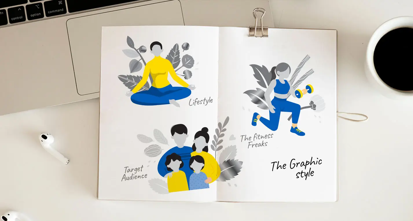
GUUD was positioned as a health and wellness brand for the “health-conscious fence sitter” — someone who seeks better choices without drastic lifestyle changes.
This formed the foundation of the entire D2C brand building journey
Logo Identity
The Logo identity was crafted to reflect goodness, health, and ease:
- Clean, modern wordmark
- The letter ‘G’ inspired by a human/yoga posture
- Reflecting balance, movement, and wellness
Colour Strategy
- Blue → Science, trust, innovation
- Yellow → Positivity, healthier living
This combination ensured the wellness branding felt both credible and optimistic
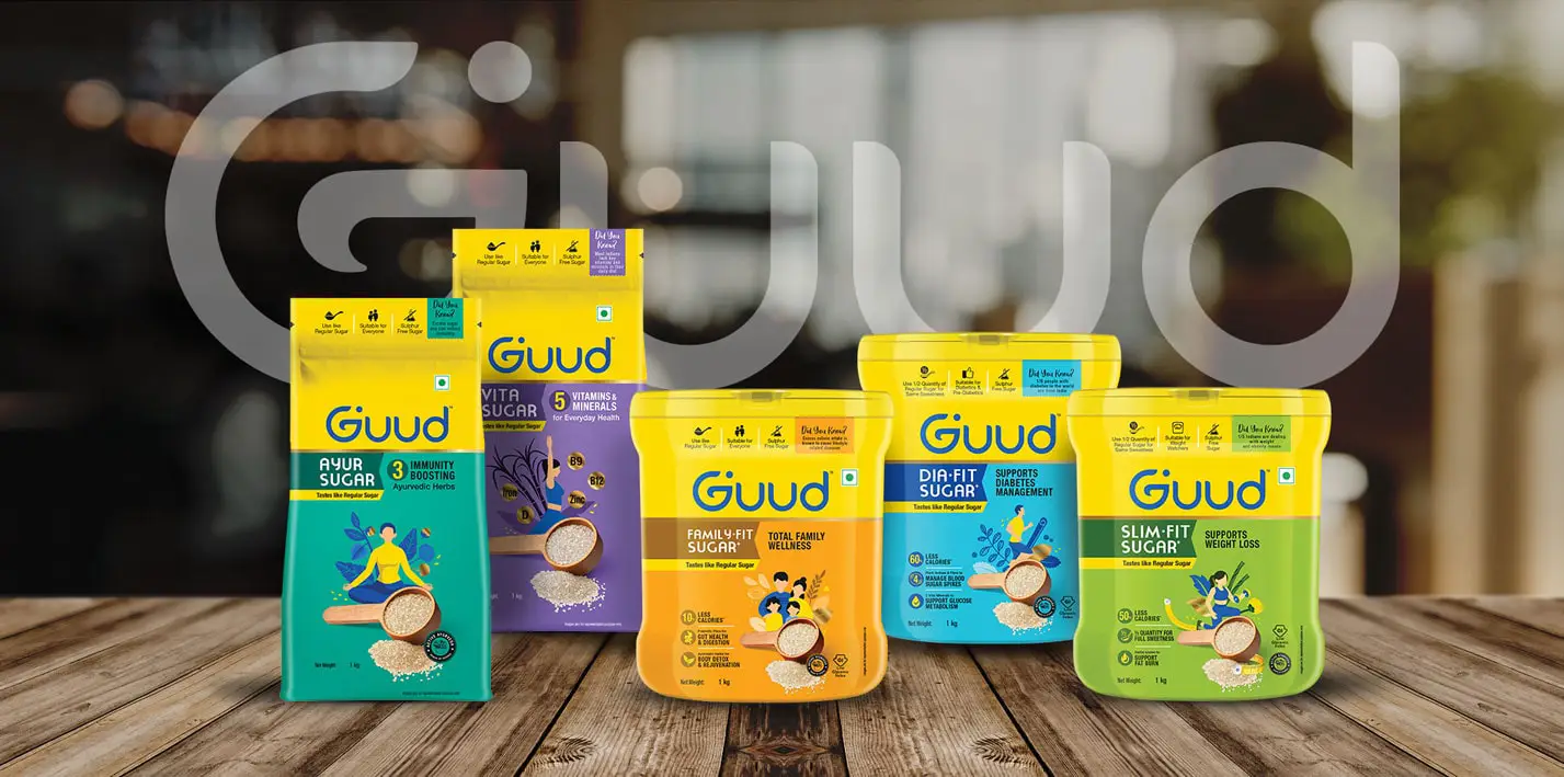
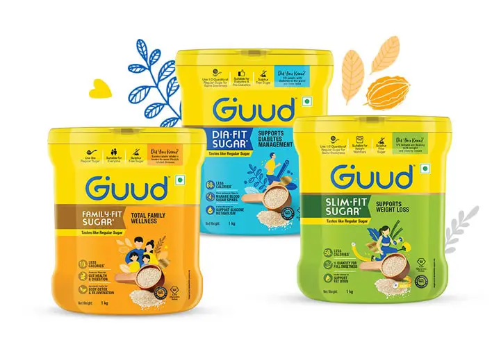
Visual Architecture Design
With a wide product portfolio spanning:
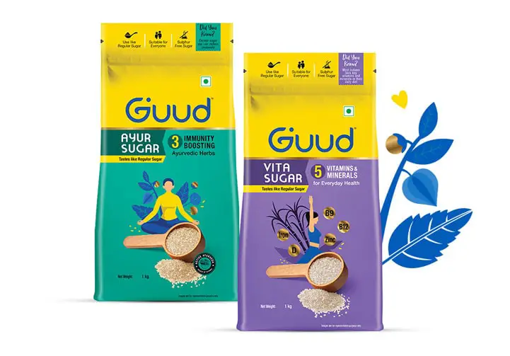
- Ayurvedic herb-infused sugars
- Vitamin-fortified sugars
- Diabetic-friendly sugars
- Future-ready sweeteners and sugar substitutes
A strong architecture design was critical.
Almond Branding created a structured system with intuitive naming:
- Ayur Sugar
- Vita Sugar
- Dia-Fit Sugar
- Slim-Fit Sugar
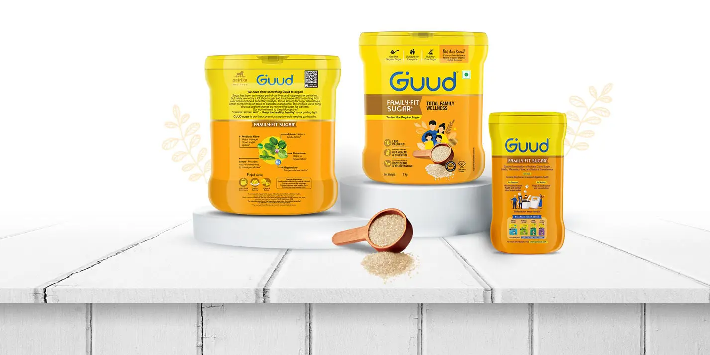
- Family-Fit Sugar
This ensured:
- Clear differentiation across offerings
- Easy navigation for consumers
- A unified yet flexible system for expansion
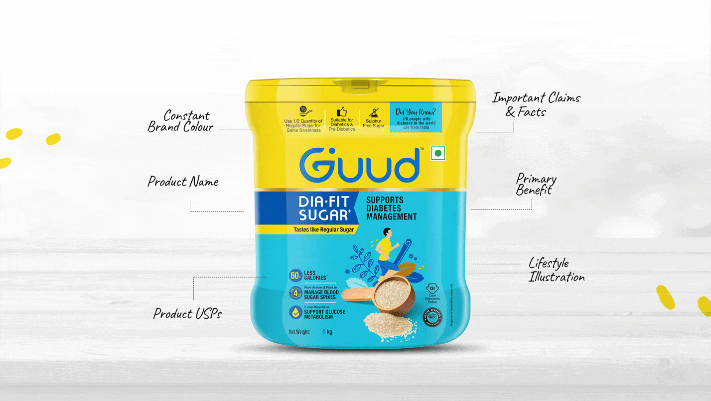
Health Food Packaging Design
The health food packaging design was central to building credibility and shelf impact.
Premium Yet Approachable
The packaging needed to break away from the commodity look of traditional sugar brands while justifying a premium price.
- Clean layouts with strong visual hierarchy
- Balanced use of white space and information
- Modern, global design sensibility
This elevated the overall FMCG packaging design to a premium level.
Visual Architecture & Packaging System
A robust packaging design system was created to manage complexity across SKUs and price tiers.
- Consistent brand blocks for recognition
- Variant differentiation through structured elements
- Clear zones for product, benefits, and communication
This strict visual architecture & packaging ensured:
- Strong shelf presence
- Easy scalability
- Cohesive family look across products
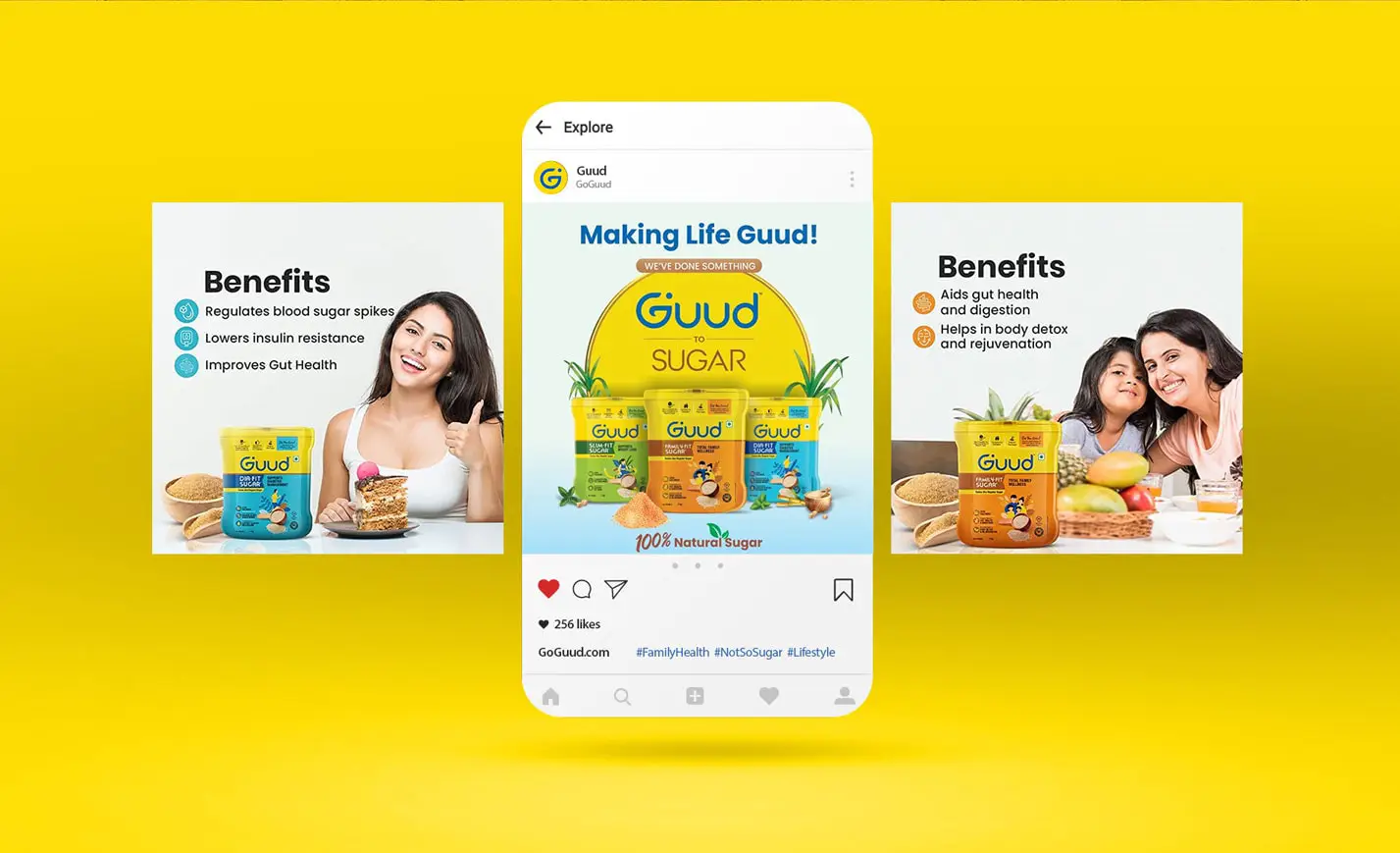
Infographic-Led Packaging Design
Given the innovative nature of the products, consumer education was critical.
Instead of overwhelming users with text, Almond used:
- Infographic packaging design
- Mnemonics to highlight RTBs (Reasons to Believe)
- FAQ-style communication directly on the Front of Pack
Questions like “Does it taste different?” were proactively answered — making the packaging highly consumer-friendly
Science Meets Lifestyle
The packaging beautifully balanced science with relatability.
- Scientific benefits clearly communicated
- Human figures engaged in yoga and light exercise
- Reinforcing the idea of a healthier, active lifestyle
This made the health packaging design both informative and emotionally engaging
Sugar & Sweetener Packaging Design
As a category-first brand, GUUD required a distinctive approach to:
- Sugar packaging design
- Sweetener packaging design
The system ensured:
- Clear differentiation from regular sugar brands
- Strong communication of added benefits
- Premium cues to justify higher pricing
This helped GUUD stand out in both domestic and international markets.
Impact
- Successfully launched GUUD as a modern wellness brand
- Created a differentiated health food packaging design system
- Elevated sugar into a value-added, premium category
- Built a scalable brand for India and global markets
Outcome Snapshots
- Strong wellness branding system
- Premium sugar & sweetener packaging design
- Scalable brand architecture
- High clarity through infographic-led packaging
Almond Branding’s Expertise
- Health food packaging design
- Wellness branding
- Brand architecture design
- Sugar & sweetener packaging design
- Startup brand creation