The Design Approach
The strategy was built on three clear moves: keep Tokla bold and visible, introduce premiumisation through a sharper visual hook, and communicate freshness and organic cues clearly on the front of pack while supporting the health story on the back of pack. This made the premium tea packaging design feel contemporary without becoming disconnected from the brand’s roots.
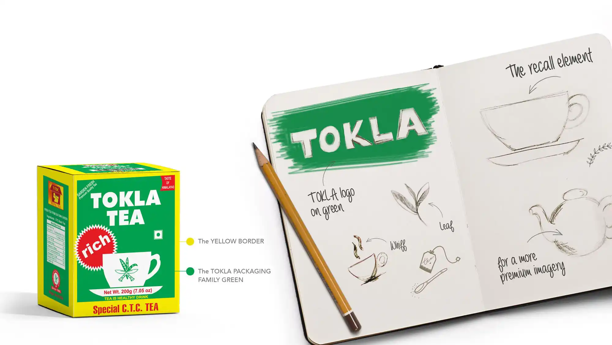
Visual Identity for Tea Packaging
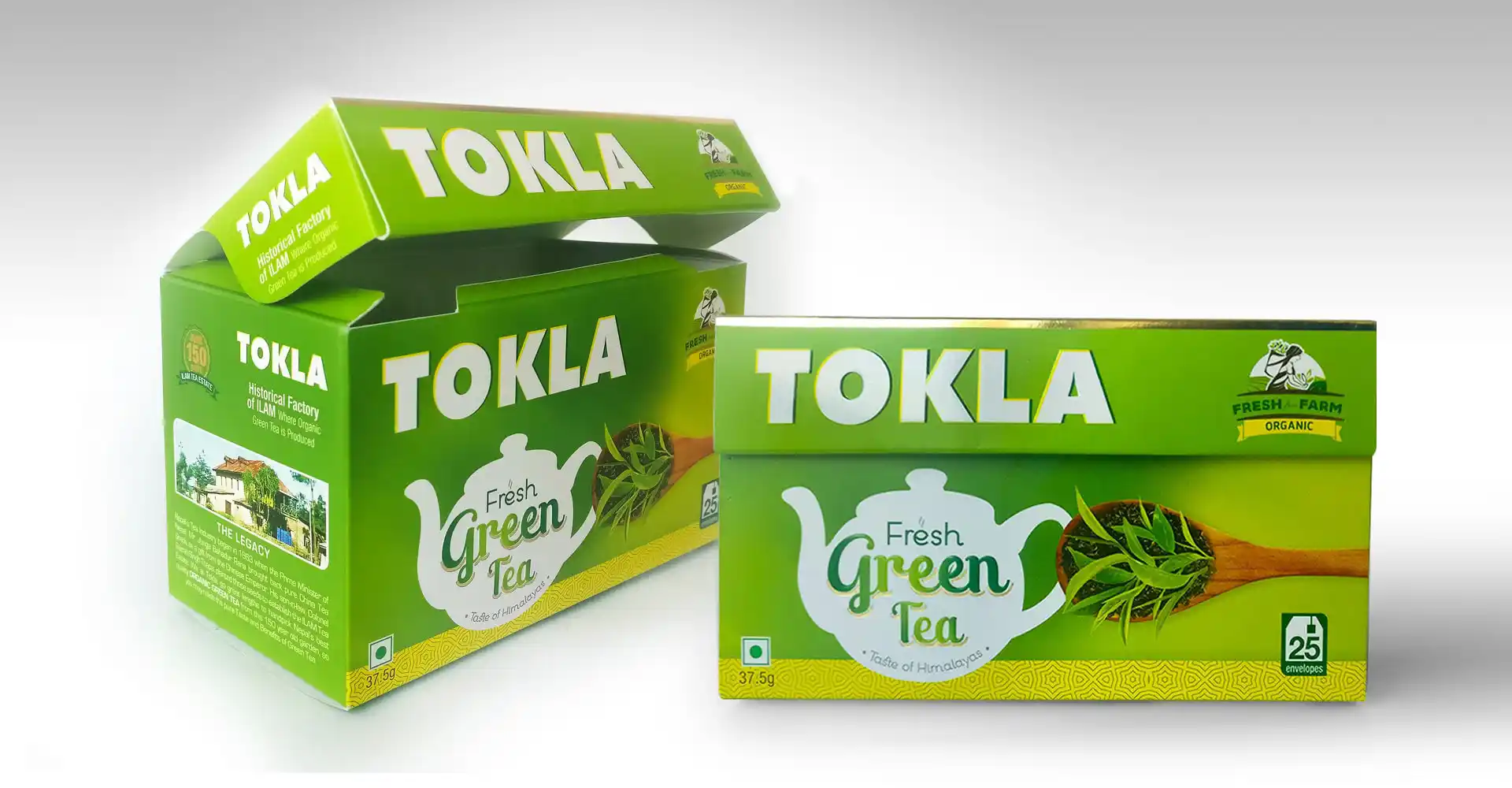
A refined visual identity was developed using Tokla’s heritage codes in a more elevated way. The familiar dark green base, white typography, and central teacup were retained, but the layout was tightened to feel cleaner, more modern, and more premium. This ensured the pack remained instantly recognisable while better fitting the evolving green tea category.
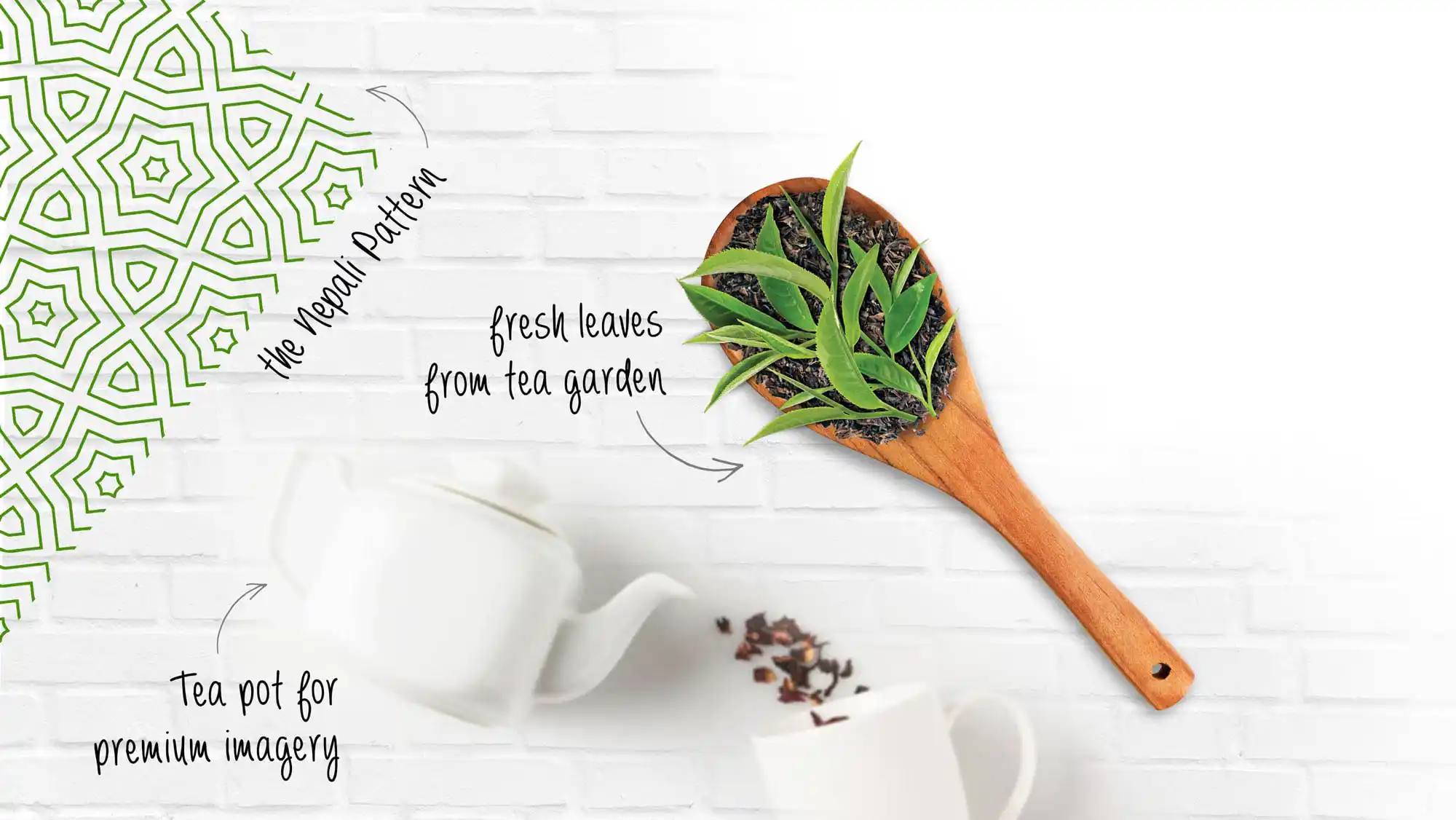
Green Tea Packaging Design Solution
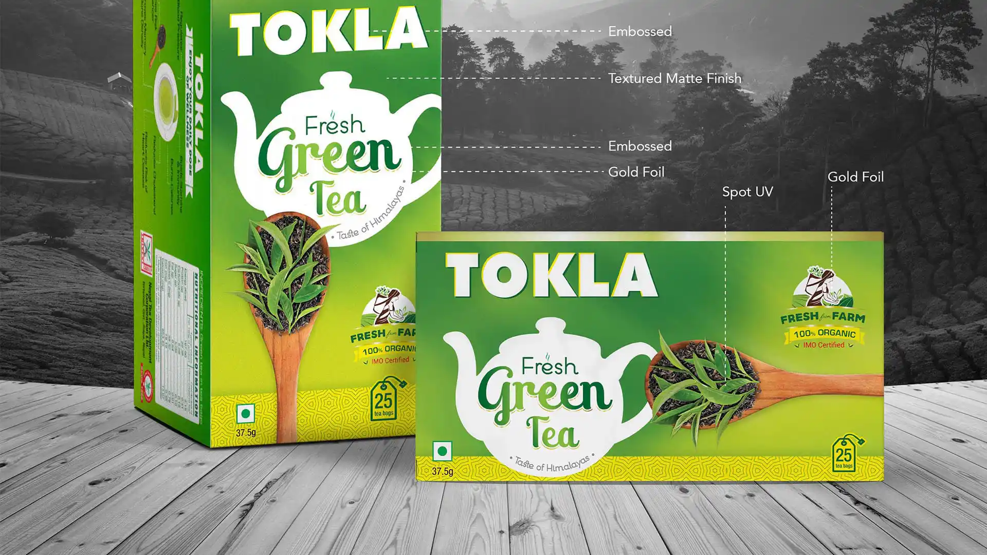
The green tea packaging design introduced a Nepali patterned band at the base and a gold-foiled edge at the top, creating a strong frame around the pack. A grainy texture, spot UV, embossing, and gold foil brought depth and tactility, helping the pack stand out on shelf while still belonging unmistakably to the Tokla family. The overall system worked equally well in horizontal and vertical formats, making the design highly adaptable.
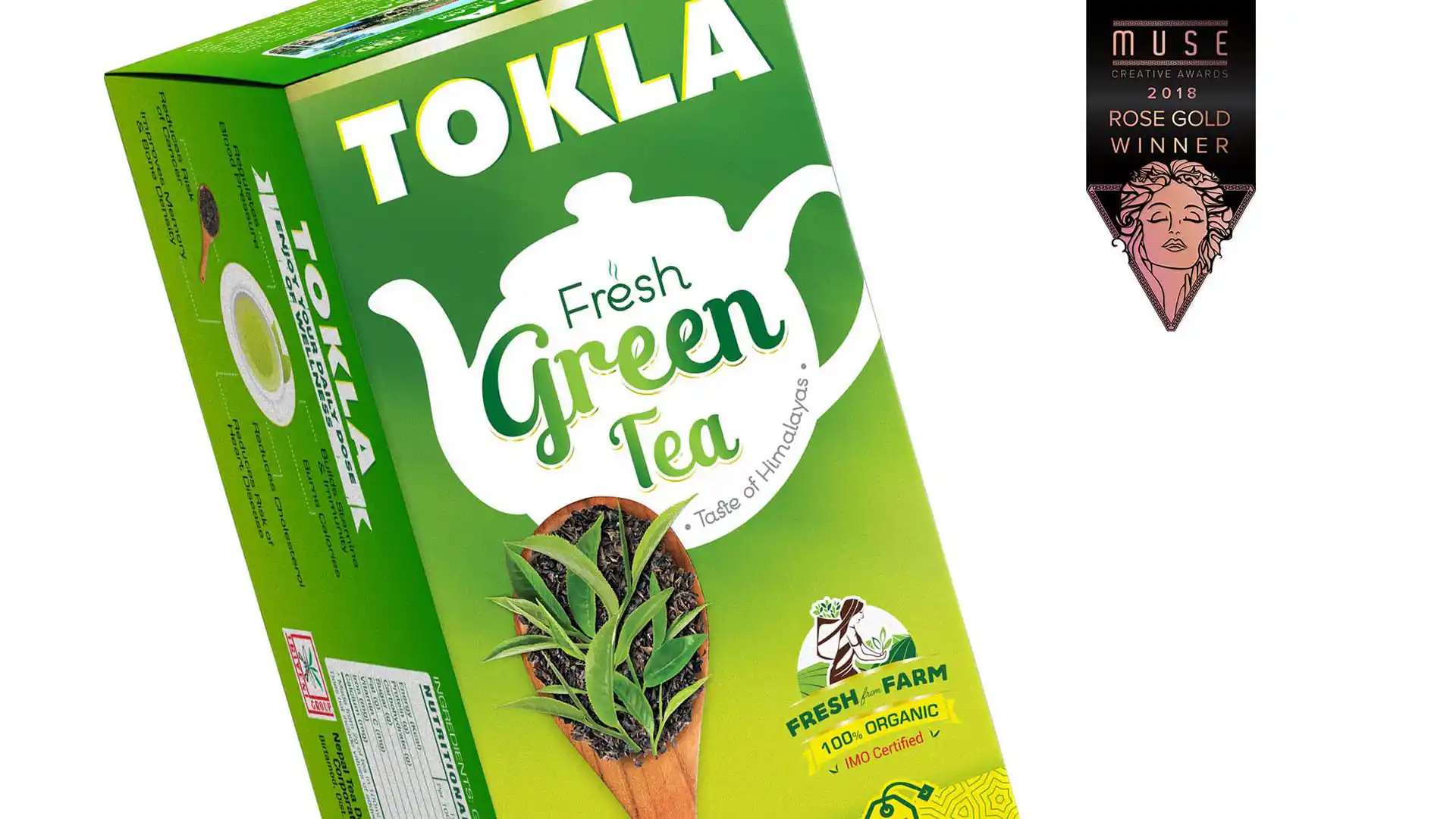
Shelf Impact & Premium Appeal
The new tea packaging design gave Tokla stronger shelf differentiation in a category that is often visually crowded or overly functional. The result was a premium pack with better recall, stronger brand presence, and a more contemporary feel for the wellness beverage audience.
Extendable Visual Architecture
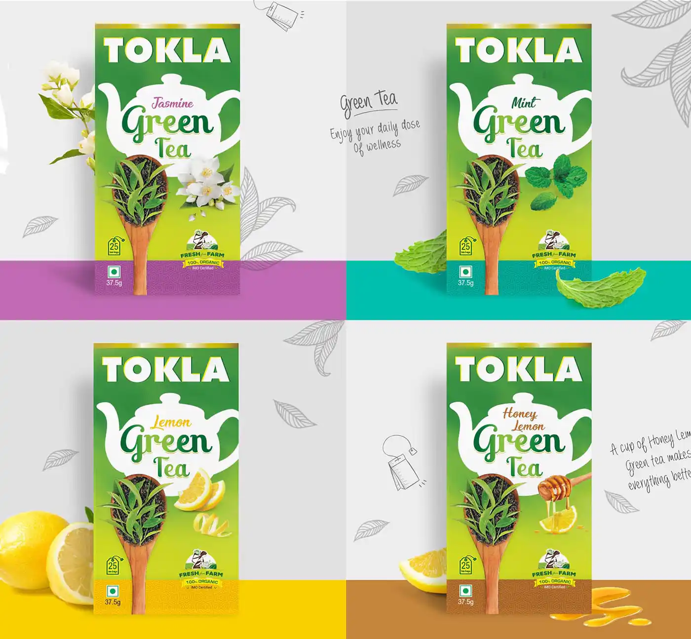
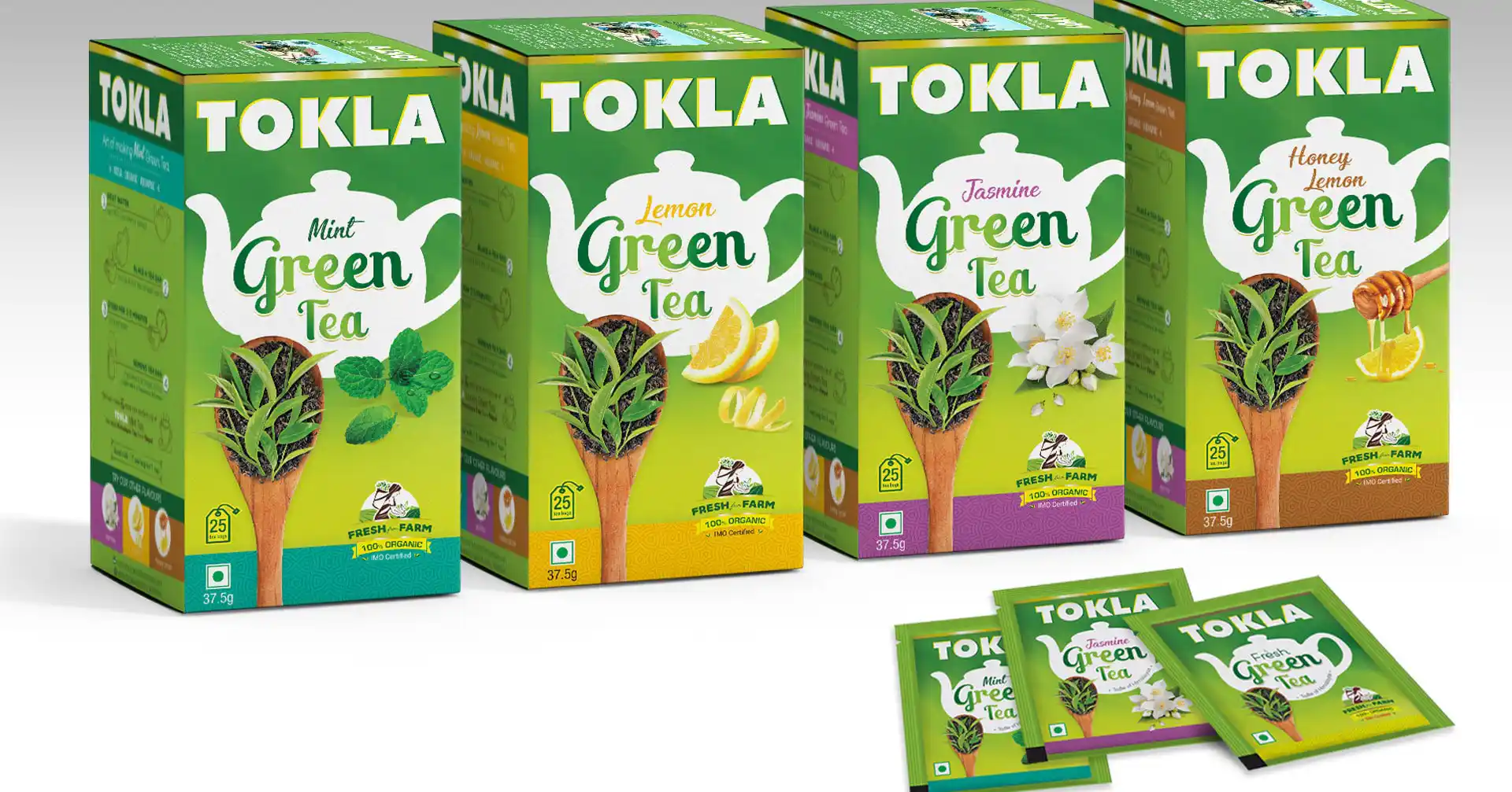
Although the initial brief was for one original green tea variant, the visual architecture was designed to extend naturally. Because the core structure was so smartly built, Tokla later expanded the range into four more variants, creating a stronger portfolio without redesigning the system from scratch. That extensibility is a key strength of good packaging design for tea brands.
From One Variant to a Portfolio
What began as a single green tea packaging design project evolved into a full portfolio of five variants. The success of the original pack validated the design system and showed how a well-built visual architecture can support brand growth over time.
Impact
Tokla’s new packaging helped preserve brand equity while creating a more premium and health-forward identity for its green tea line. The redesign modernised the brand, improved shelf visibility, and laid the foundation for a much larger product family. The success of the first variant proved the strength of the system and unlocked portfolio expansio
Outcome Snapshots
Premium tea packaging design with heritage continuity Strong green tea visual identity Extendable variant architecture Better shelf impact and recall
Almond Branding’s Expertise
- Tea packaging design
- Green tea brand systems
- Premium FMCG packaging
- Scalable visual architecture
- Wellness beverage branding