
The Brief
Amul Cheese Spreads, one of the flagship products from Amul’s portfolio, had been sporting a dated packaging look and was steadily losing relevance in a market now dominated by trendier spreads such as mayonnaise and flavoured sauces.
The objective was to undertake a complete cheese packaging design revamp that could modernise the brand, improve shelf visibility, and re-establish Amul Cheese Spread as a relevant, aspirational everyday product.

The Challenge
The packaging had to address three core issues:
- Outdated visual language in a fast-evolving FMCG category
- Strong competition from visually appealing new-age spreads
- Lack of clear communication around the product’s biggest USPs
The challenge was not just aesthetic — it was about repositioning cheese spreads as a contemporary, versatile product while reinforcing Amul’s core strength of purity.
The Design Strategy
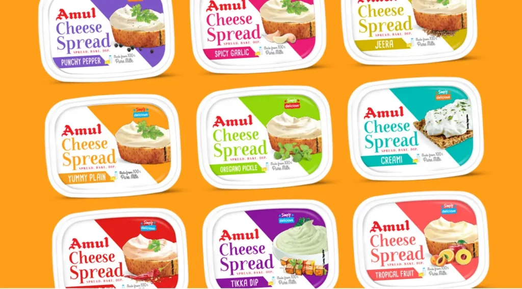
The product packaging redesign was built on three clear pillars:
1. Highlight Versatility
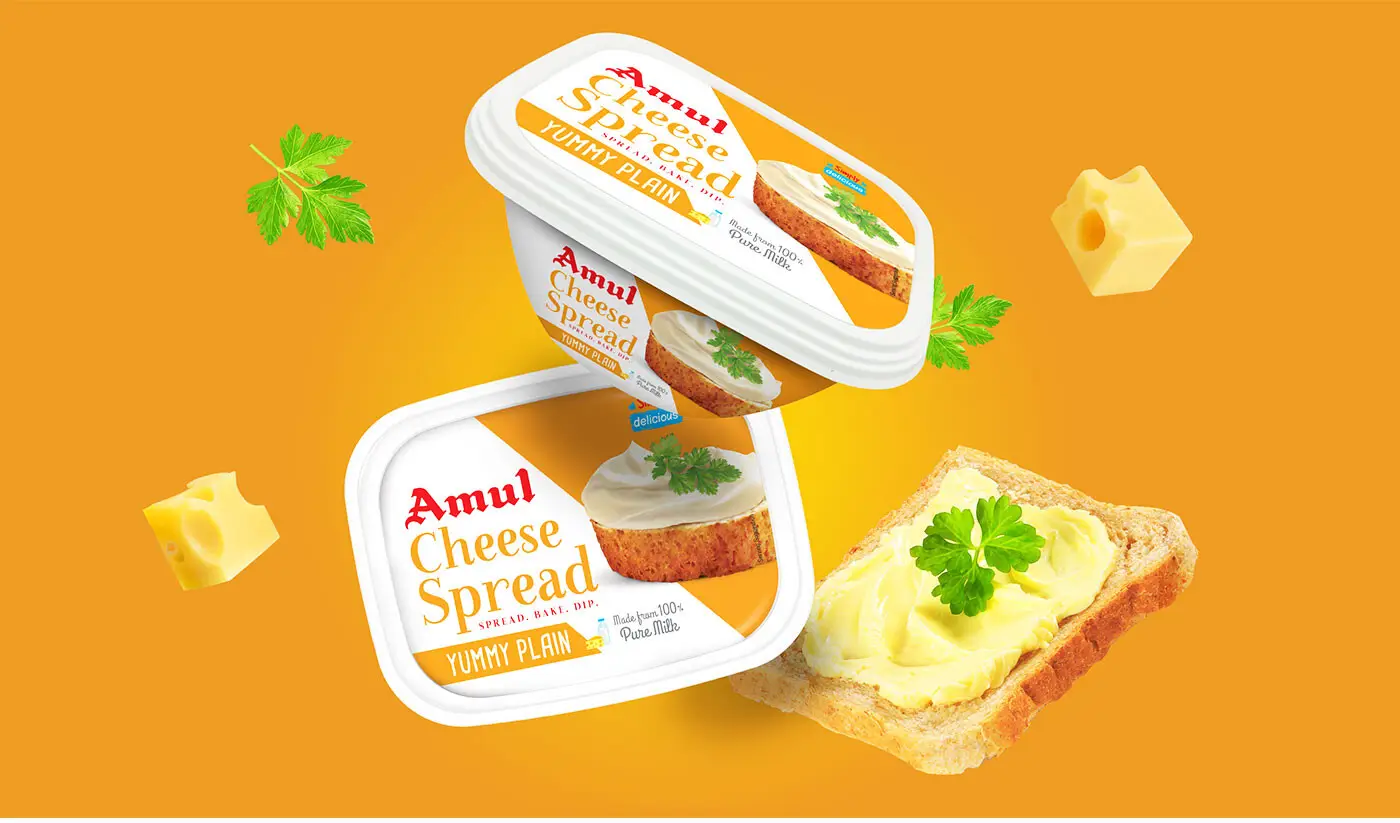
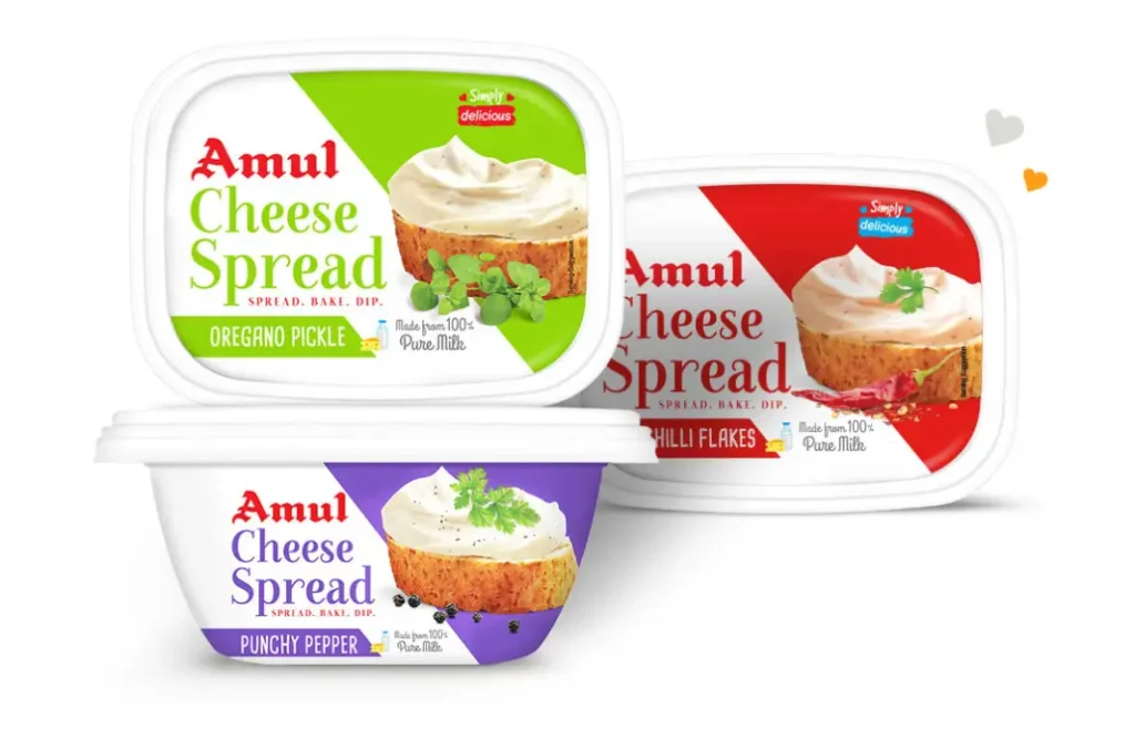
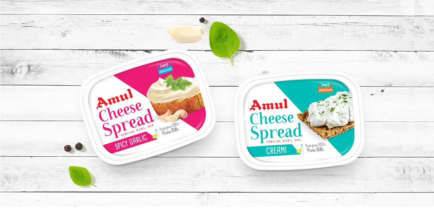
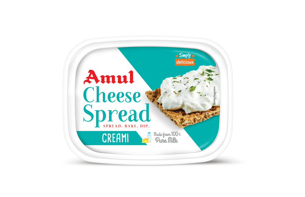
The idea was to showcase cheese spread as more than just a sandwich filler. The concept “Scoop it up, Spread it out” communicated multiple usage occasions and increased product relevance.
2. Make it Aspirational
Instead of showing plain bread applications, the packaging was designed to feature styled food visuals that made everyday consumers feel like home chefs — turning a basic spread into a gourmet ingredient.
3. Highlight the Goodness of Milk
The design leaned heavily on Amul’s legacy of purity, reinforcing the fact that this product is made from real milk and cheese, unlike artificially created spreads.

The Visual Architecture
A robust visual architecture was created to define what remains constant and what changes across the entire Cheese Spread range. This ensured strong brand consistency while allowing flexibility for easy future extensions.
This structured visual system sets the visual weightage of every element on the pack, making the range highly scalable, easy to navigate on shelf, and future-ready for new variants.
Key elements like product branding, white base, and core layout were kept constant to build instant recognition. At the same time, flavour cues, colour codes, and food visuals were treated as variable elements to enable clear differentiation.
Communicating the USP
The biggest strength of the product — being made from pure milk — was highlighted through a smart modern mnemonic.
· Bold “100%” cue for instant recall
· Clear emphasis on “Pure Milk”
· Easy-to-understand visual language for mass consumers
This made the cheese spread packaging design both informative and persuasive at the shelf level.

Variant Differentiation
Bright and intuitive colour coding was used across variants to make selection easy.
- Strong shelf impact in multi-SKU environments
- Clear navigation across flavours
- Consistent structure for brand recall
The variant system ensured quick decision-making while maintaining a unified brand identity.
Impact
- Repositioned Amul Cheese Spread as a modern FMCG product
- Improved shelf visibility in a cluttered category
- Shifted perception from dated to aspirational
- Reinforced product purity as a key differentiator

Outcome Snapshots
- Future-ready cheese packaging design system
- Strong shelf presence
- Clear USP communication
- Enhanced versatility perception
Almond Branding’s Expertise
- FMCG packaging design
- Cheese packaging systems
- Product packaging redesign
- Shelf-ready design strategy
- Variant-led packaging logic


