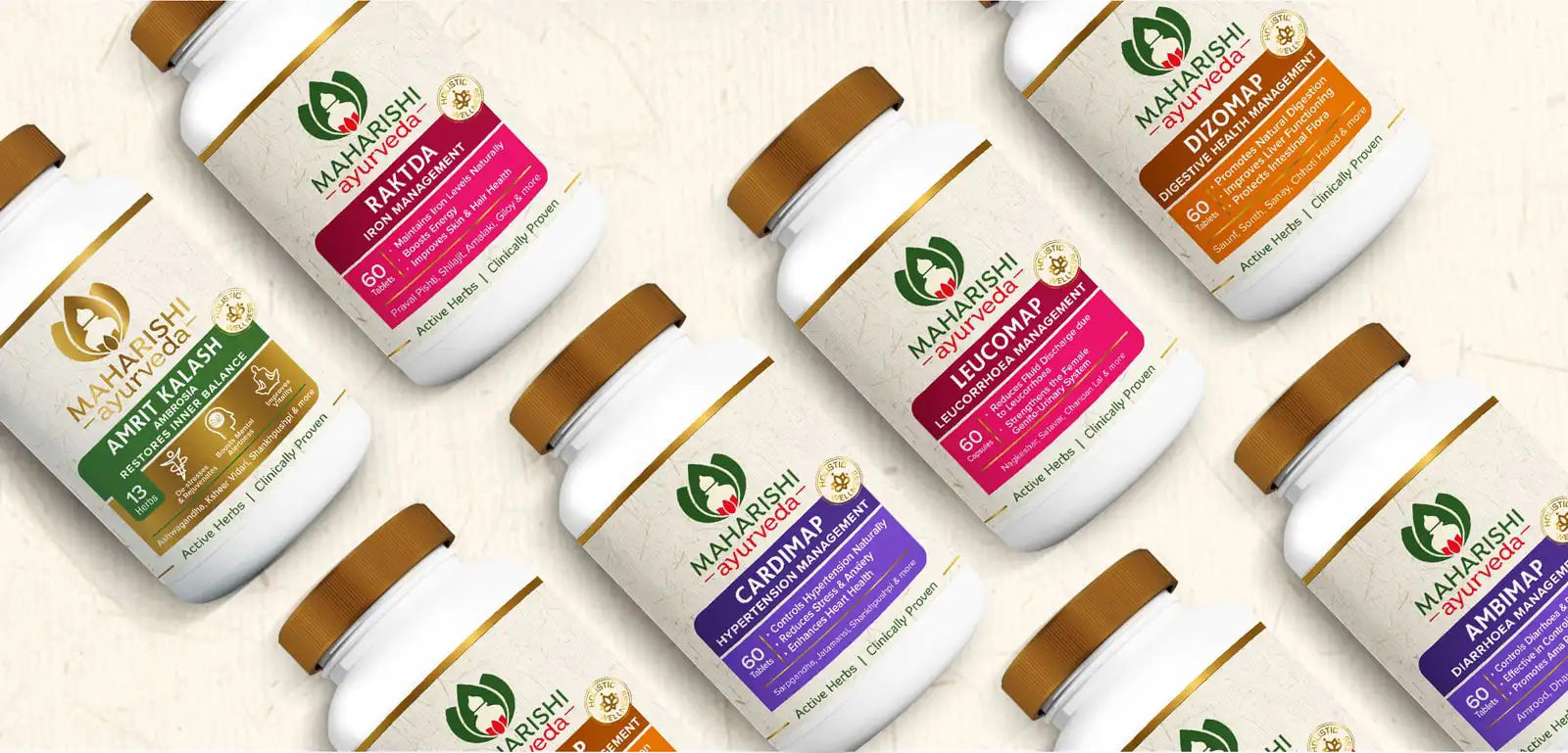
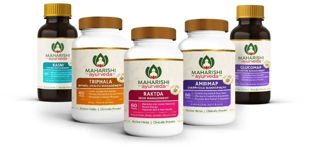
Active Herbs | Clinically Proven
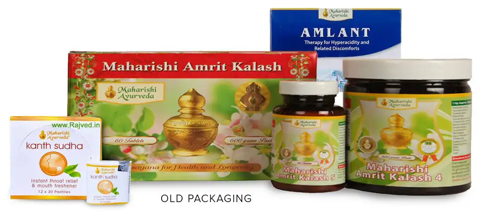
Packaging Design Realignment
Since the product portfolio had grown organically over the years, there was no cohesive thought, nor standardised messaging hierarchy or unified tone of voice across the existing packaging.
Though quite effective individually as efficacious products, there was no unified brand equity being built on the shelves due to lack of uniformity in packaging design. Packaging design realignment was the obvious next step.
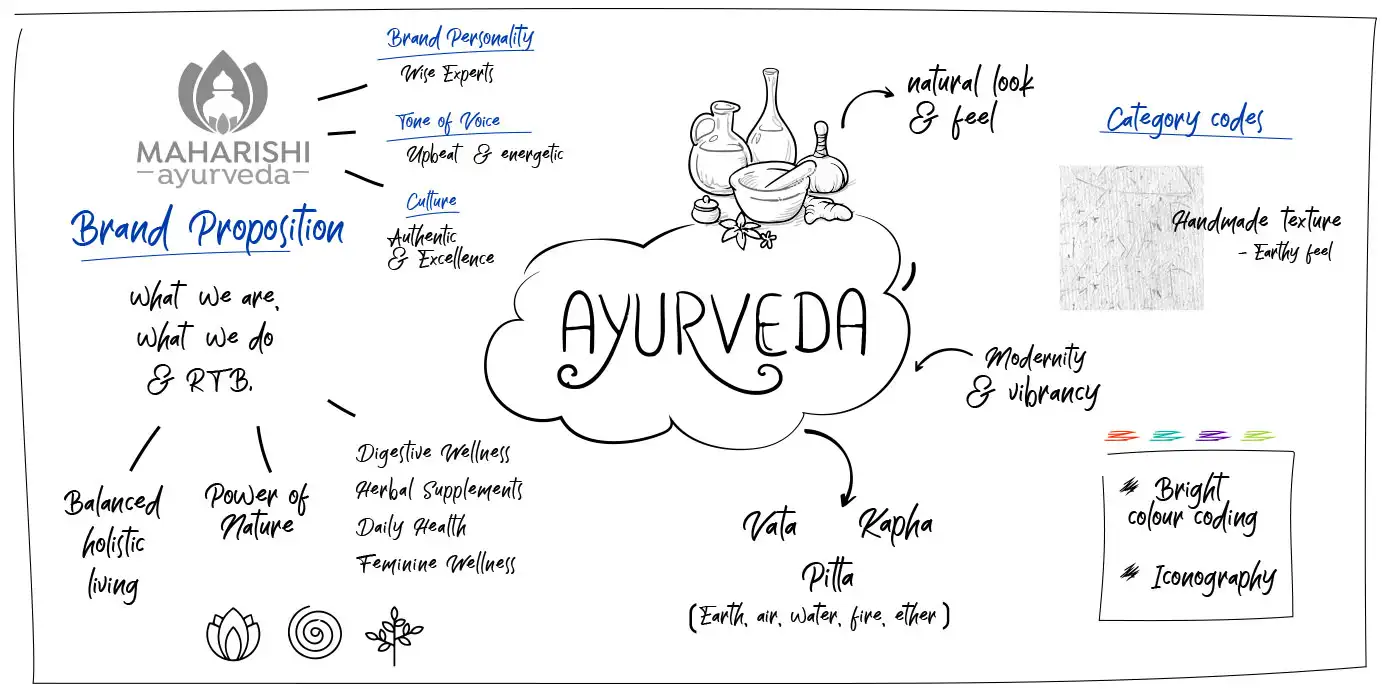
The Design Language
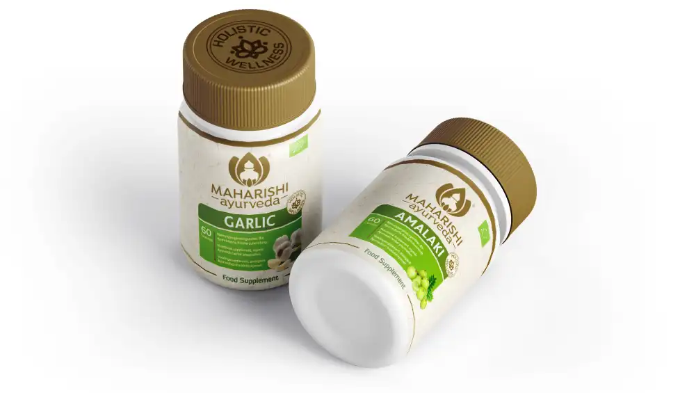
Colour coding was proposed for differentiation between categories where formats may be very similar. A handmade paper textured background was imparted to the entire domestic herbal supplement range to connote the authenticity of Ayurveda. Additionally, smart visual assets like the Brand button, helped conjure the desired imagery.
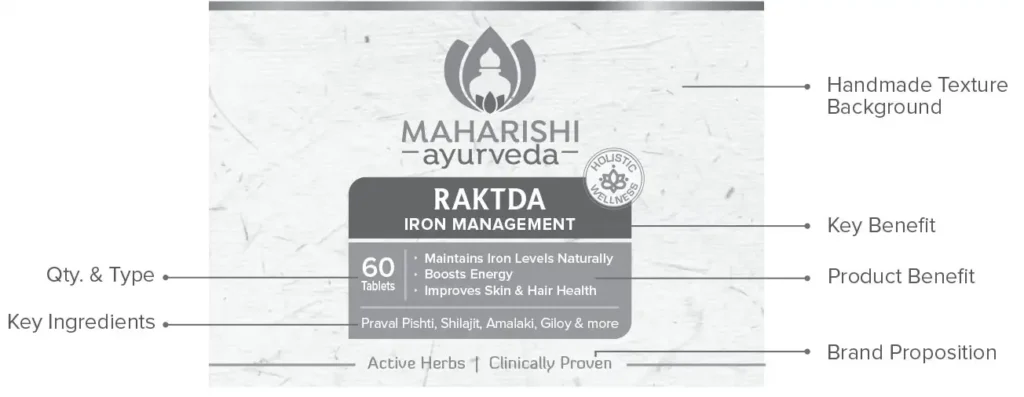
The Visual Architecture
A strict Visual Architecture was crafted to define the constant and variable elements of the design language. Considering the short attention spans of today’s TG, a one liner benefit was added just after the Product Branding to quickly decode the offering. The more detailed benefit list was introduced further down into the hierarchy.
Since there is low awareness about ingredients, efficacy & compliance of Ayurvedic products; especially across the important overseas markets, we developed the design strategy to clearly call out promised benefits and reasons to believe in that order. With a very contemporary look-and-feel, we still kept the roots well within authentic Ayurveda practices and choicest natural ingredients story. A sign-off line “Active Herbs, Clinically Proven” established the close to a century of research-based, professional expertise in applying knowledge garnered from Veda & Ayurveda to deliver highly efficacious & soul-nourishing offerings.
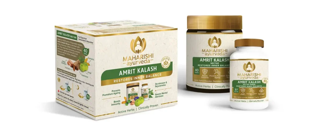
The Flagship Product Packaging
Since Amrit Kalash is their signature product, its packaging was made to look extra rich and exceptional, to command the premium price point and also make it worthy of the product itself. Generous use of gold and post-printing effects on the Packaging helped uplift the imagery.
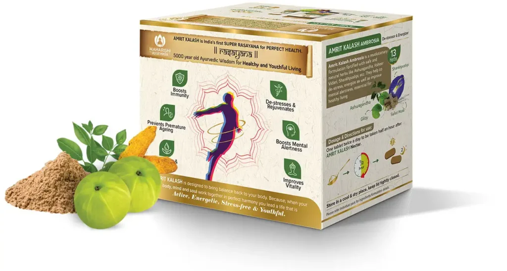
The Imagery Facelift
Ayurveda has always been intrinsic to Indian culture but has become far more relevant to consumer’s lives today. Maharishi Ayurveda has been a research-based organization using authentic ayurvedic formulations & methods to suit modern living conditions.
The overall branding & design solution now reflect the change from a dated brand to one that brings to life the values of authentic Ayurveda for a progressive lifestyle