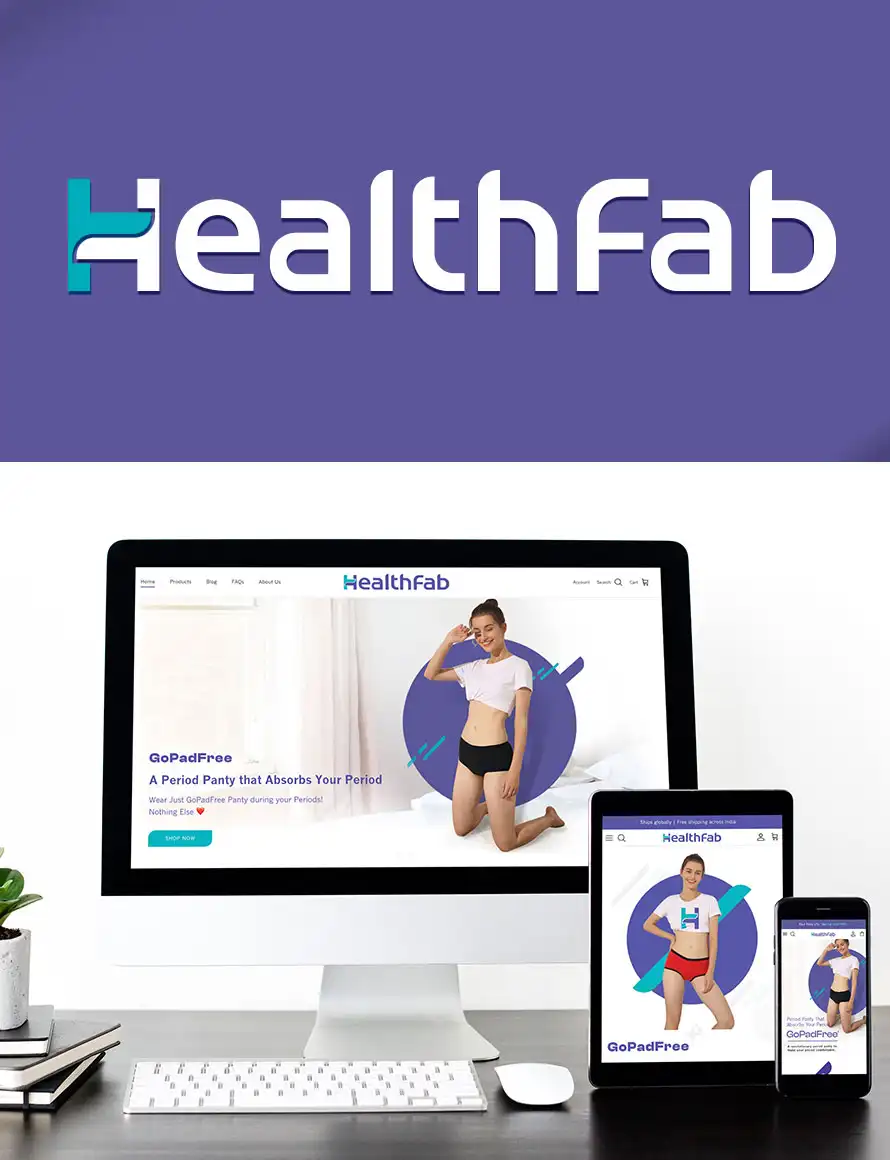

HealthFab – Revamping a FemTech Startup Brand
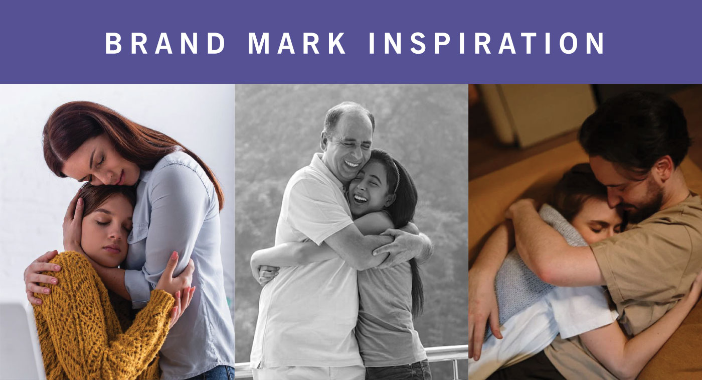
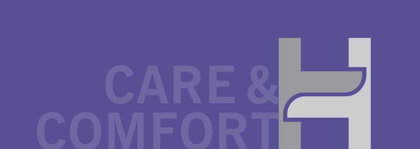
Healthfab stands for Comfort, Care, and Sustainability, and we made sure that the newly designed Visual Identity embodied these core aspects. The wordmark itself draws inspiration from a comforting hug, symbolizing the caring and nurturing experience that the brand promises
The Brand Context
Healthfab is a fast-growing D2C femtech startup focused on redefining women’s intimate and menstrual health products with innovation, sustainability, and science-led thinking.
As the brand prepared for rapid scale and global expansion, it faced a critical challenge — its existing identity lacked consistency, clarity, and a strong visual system that could travel seamlessly across products, platforms, and markets.
The Challenge
- Fragmented visual identity across packaging, website, and communication
- Lack of a defined brand design language
- Need for a scalable visual identity system for D2C growth
- Communicating trust, care, and innovation without appearing clinical
- Standing out in a cluttered femtech and wellness market
Healthfab needed more than a cosmetic refresh — it needed a cohesive D2C startup branding system built for scale.
The Strategic Approach
Almond Branding approached the project by first defining the strategic brand foundation that would guide all visual decisions.
Our focus was to:
- Create a clear, ownable brand design language
- Build a modular visual identity system adaptable across SKUs
- Balance softness, confidence, and credibility
- Ensure the identity worked equally well on D2C platforms, packaging, and global markets
The strategy was rooted in long-term brand building, not short-term aesthetics
The Visual Identity System
A Scalable Brand Design Language
We developed a comprehensive visual identity system that translated Healthfab’s purpose into a clear, recognisable brand language.
Key elements included:
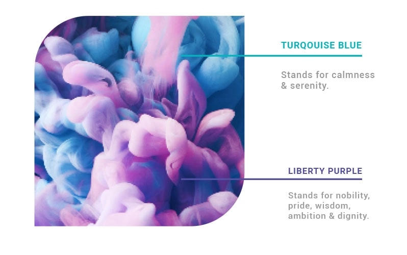
- A refined colour palette reflecting care, warmth, and confidence
- Typography that balanced approachability with authority
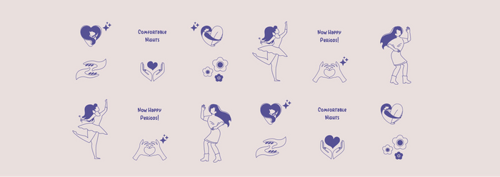
- Graphic elements inspired by movement, comfort, and support
- Consistent visual rules to ensure clarity across touchpoints
This system ensured Healthfab looked distinct, modern, and credible across digital and physical environments
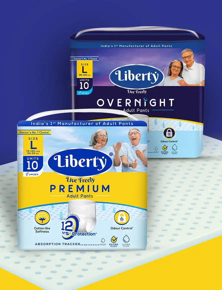
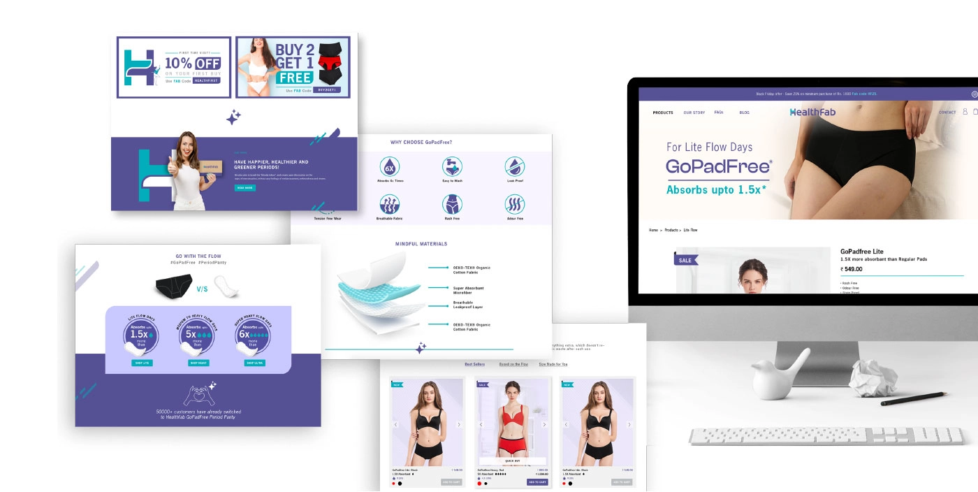
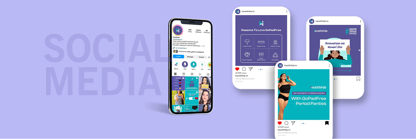
D2C-Ready Brand Execution
The new D2C startup branding was rolled out across:
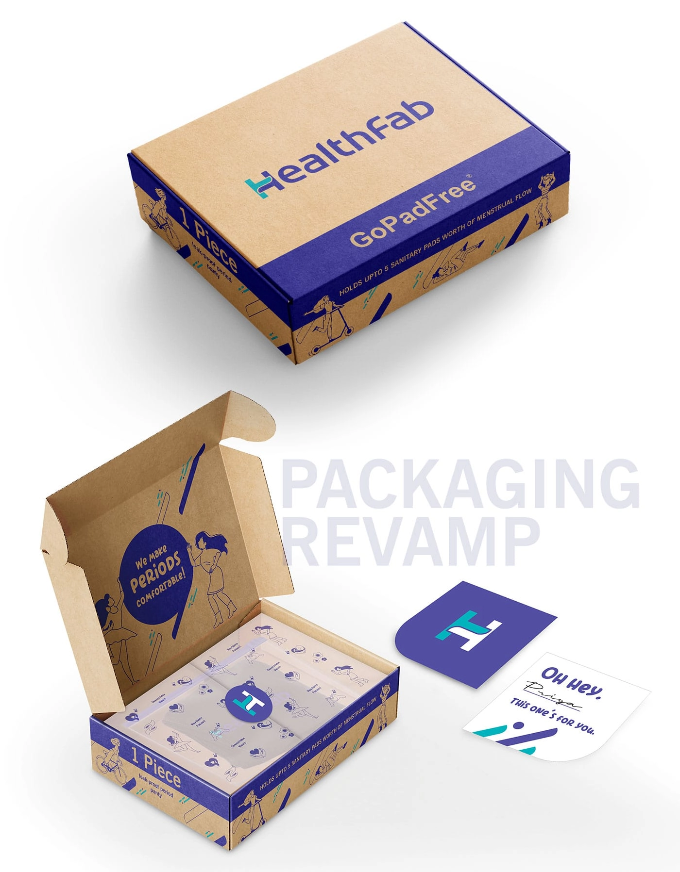
- Product packaging
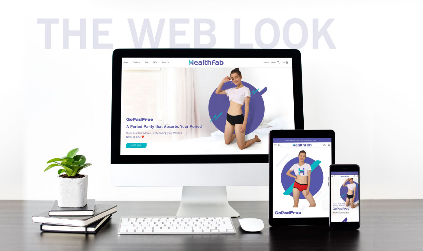
- Website and digital storefront
- Marketing communication and social media
- Brand guidelines for internal and partner alignment
Every execution reinforced the same visual logic, making the brand instantly recognisable and easy to scale.
The Impact
- Exponential business growth: Healthfab scaled from ₹30 lakh annual turnover in 2023 to ₹8.4 crore per annum by 2025, reflecting rapid market acceptance and strong brand-led momentum.
- A unified visual identity system built for D2C scale
- Clear differentiation in the competitive femtech category
- Improved brand consistency across platforms
- Stronger emotional connect with modern women consumers
- A future-ready brand language adaptable for new products and markets
Healthfab emerged with a brand identity that felt confident, contemporary, and globally relevant.

Outcome Snapshot
✔ Cohesive D2C startup branding system
✔ Clearly defined brand design language
✔ Scalable visual identity for global growth
✔ Stronger shelf, screen, and social presence
Almond Branding’s Expertise
This project reflects Almond Branding’s strength in:
- D2C startup branding
- Visual identity system design
- Brand design language creation
- Femtech and health brand branding
- Building brands ready for scale
Testimonial
Our mission at Healthfab has always been to provide cost-effective and comfortable solutions to women of all backgrounds, challenging preconceptions while promoting innovation in health and hygiene through eco-friendly and sustainable methods. The collaboration with Almond Branding has been instrumental in amplifying our vision and taking Healthfab to new heights.