Fun Flips Brand & Packaging Revamp
ClientJK GroupCategoryFood & BeveragesServicesBranding | Brand Identity | Packaging Design
Redefining Fun in the Snacking category
Fun Flips was launched in 1994 as a pioneer in the puff category. Over last few years, the brand has moved out of the consideration set of its core TG due to lack of any brand-building initiatives. JK group of companies has recently acquired the Fun Flips brand and brought on board Almond Branding, India’s top Strategic Branding and Design agency, with the intention of re-energising the brand. The most critical challenge was to maintain and strengthen its existing consumer base and attract new consumers as well.
Fun Flips has been a brand of choice for ages in Delhi and neighboring states.
The brand has a strong equity in the Rs.5 price point but lacked traction in the higher price ranges. The task was to upgrade the Brand imagery in a way that the consumers not only fall in love with the new revamped Brand Identity and Packaging but also embrace the brand at higher price points as well.
For the 'Fun Starter' Brand Positioning
The intention was to be the one; with whom Fun starts. The Fun Centre.
Snacking is an integral part of Fun time; An enabler, facilitator, catalyst to indulge in having fun.The brand language needs to bring to life the world of fun and the indulgence we seek from a taste perspective
The Brand Identity Revamp
The brand identity was simplified and modernized for the next generation of munchers, while maintaining the positive attributes that had built the brand’s success and credibility over the years.
Semiotics of FUN
We decoded Fun to its lowest denominators – from guarded fun to break-free fun or from self to group fun. We realized that while Fun is an experience, the underlying feeling or emotion is that of joy, delight and excitement. The eureka moment was when we got our inspiration for the one element that would have a strong connect with the Brand Story and can tie the entire range together – The exclamation mark.
The Design Strategy
A subjective space needs a visual shorthand which is aspirational as well as relevant. The desired imagery is that this brand accentuates "my reason" to interact with the category.
Snacking = Fun = Fun Flips
Since packs at a POS are the biggest merchandiser in this category and given the kind of clutter of products in the market, it is very important that we own a design language across the product range.
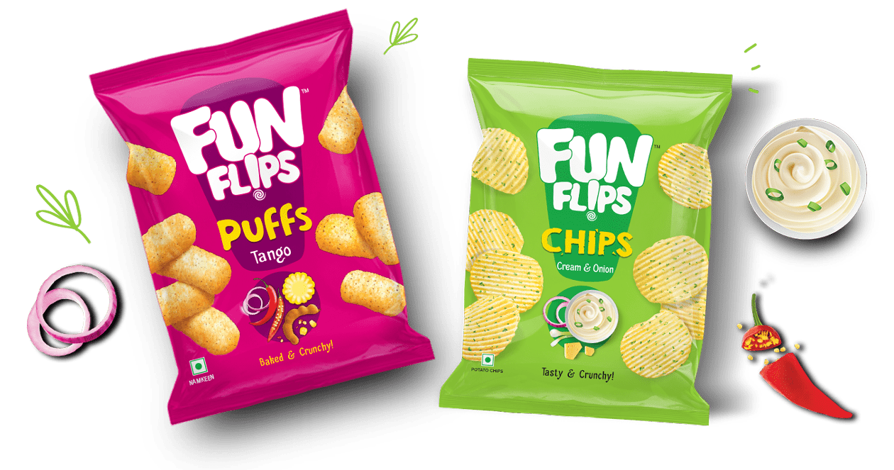
A modern unique design language which straddles across the 3 product categories (Puffs/Chips/Stix) acting as a unifier for the portfolio while different enough to highlight the category. There are 3 levels – Parent Brand(FunFlips) – product Category (Puffs/Chips/Stix) and the flavour variants.
The Unified Range look
While each range has been carefully crafted with apt choice of bright colours to stand out in the clutter while following the category codes to the intricate food styling of the ingredient story to depict the flavor variants. The random dynamism of the product on the pack captured the element of fun as opposed to the category tradition of a static composed shot at the bottom of pack.


