The Transformation of Tata Soulfull Smoothix to Tata Soulfull Nutri Drink Plus
This initiative aims to reposition the brand in the adult health drink category by emphasizing natural nutrition, taste, and appeal to health-conscious consumers.
ClientTata ConsumerCategoryAdult Nutrition | Health BeverageServicesBranding | Visual Identity | Logo Design | Packaging Design
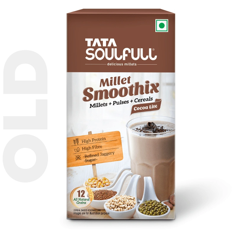
The Brand's Background
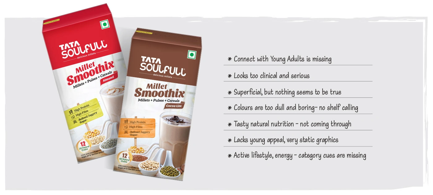
Smoothix, a drink mix made from 12 grains (millets, cereals, pulses) and jaggery, was designed for consumers seeking a convenient, nutritious, and tasty drink mix to satiate hunger. Positioned close to competitive brands like Horlicks Protein Plus and Proteinex, Smoothix boasts claims of high protein, high fiber, and no added refined sugar. However, its current positioning and packaging did not resonate well with the target audience seeking adult health and nutrition drinks. Instead, it appealed more to those seeking a convenient feel-good drink without functional benefits.
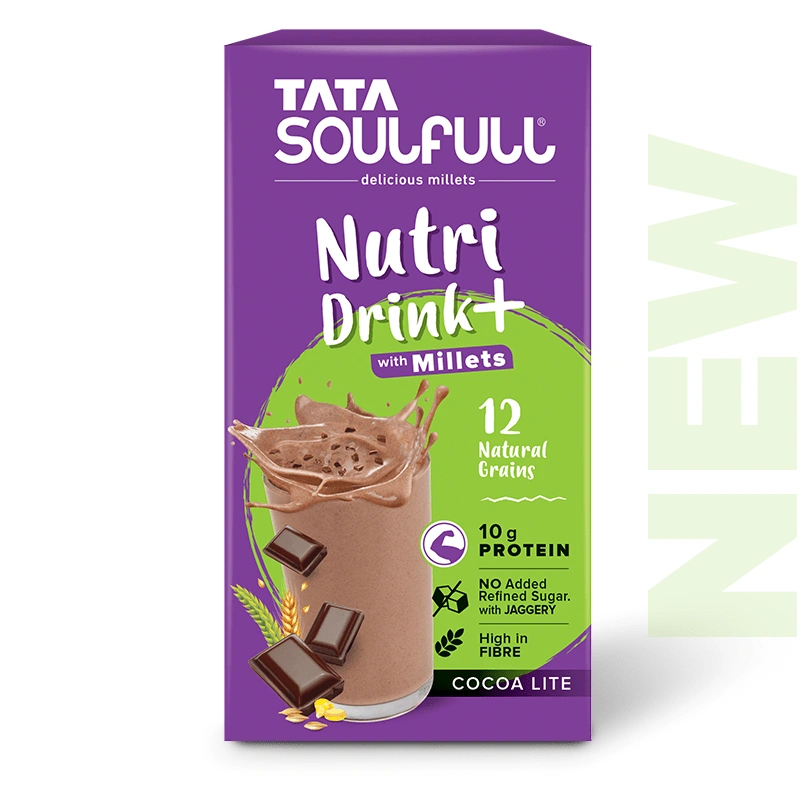
The Repositioning Goal
The goal of this exercise is to reposition the brand to connect with consumers interested in natural nutrition. The target group comprises health-conscious, active consumers looking for tasty, natural, and "better-for-you" products. The new packaging design aims to move away from a clinical appearance and align with the youthful, vibrant, and exciting imagery characteristic of successful health food startups like Yoga Bar and The Whole Truth.
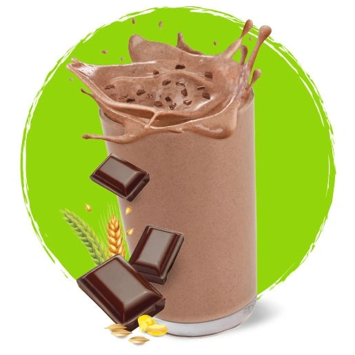
Taste-Forward and Youthful Appeal
The new design architecture avoids a clinical look and instead focuses on a lively and appetizing presentation. The product in the glass must appear vibrant and appealing.

Strong Communication of Natural Nutrition
The packaging effectively communicates the benefits of natural nutrition without deviating from category norms. Smart iconography, crisp claims, and strategic use of colours highlights the natural ingredients and their benefits.