Sizzling Joe – Revamping South India’s popular Sizzler Brand
Sizzling Joe wanted to expand their operations nationwide. It would happen through series of franchises opening all around the country, taking it up to the next level. Almond Branding joined in on board to help Sizzling Joe make the mark it wants.
ClientSizzling JoeCategoryRestaurant Branding | QSR BrandingServicesBranding | Logo Design | Visual Identity | Design Language
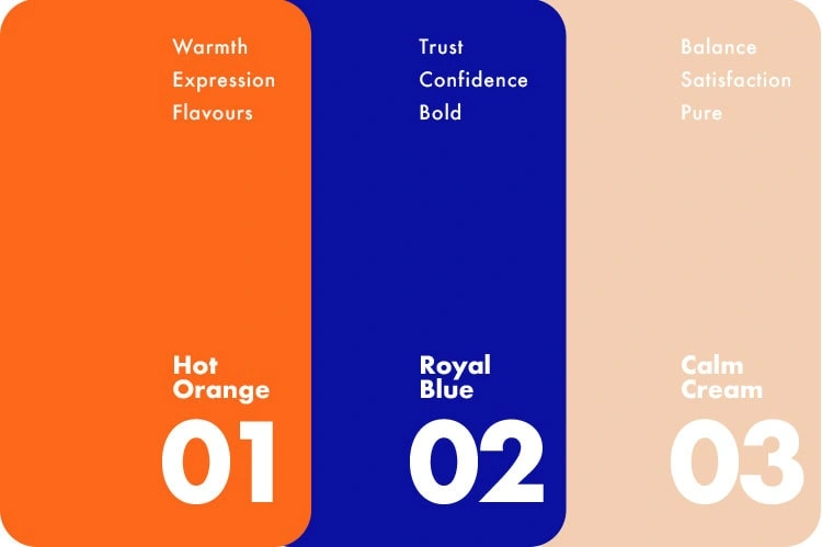
The Colour Scheme
Almond Branding helped unify the brand’s visual identity using colour theory. Three colours were used. Blue signifies Trust, Confidence and Authoritative persona. Orange signifies Warmth, Expression and Flavourful vibe. Cream signifies Balance, Satisfaction and Pure ambience. With a blend of these colours, Almond Branding gave Sizzling Joe’s visual identity a makeover and made it approachable and relatable for a nationwide audience.