Capturing the Irish Cafe feel in Packaging Design
Amul Irish Drink
ClientGCMMFCategoryFood & BeverageServicesBrand identity | Packaging Design
Strategizing Amul's Entry into Mocktails
Amul has been bringing the best of milk-based beverages to its consumers year after year. In its endeavor to serve best in class products, Amul intended to launch non-alcoholic Irish Cream flavoured milk in convenient and trendy cans.
It entrusted Almond to create a Brand around this innovative product and also develop the Packaging Design and communication.
The Same Great Taste
The TG was supposed to be Youth in the age group of 20 to 35 years residing in tier 1 and tier 2 cities. This target segment likes to experiment with their food/drinks.
Branded packaged beverages are their obvious choice for quenching their thirst and rejuvenating. Most importantly they are looking for new and exciting flavors, yet value for money products from a trusted source that is available at all nearest stores. And Amul was all set to deliver that.
The International Experience
Our mission was to bring to life Amul’s idea of bringing the international taste to the youth of India.
To capture the authenticity, it was critical for us to understand what Irish Cream stood for - to decode the entire Irish experience so that we could bring it alive for our audience. Irish Cream is the combination of the two best things you can relish at Ireland – Irish Whiskey and delicious Irish cream. The task was clear - the aura of an Irish Café had to be portrayed well on the face of a can.

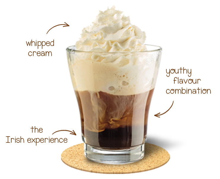
One of the unique features of Irish Cream is the characteristic layers of different colours – cream, light and then dark brown. The Brand colours were derived from these colours that is bound to visually transport you to the Irish café experience.

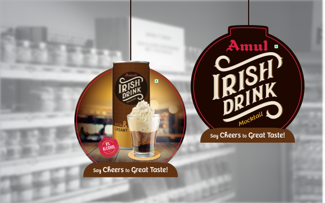
The branding was carved out of a classic bold font type etched on an oblongish dark brown unit – hard to be missed even from a distance.
The visual hook was an asymmetrically placed Irish Cream inspired shot glass with 3 characteristic coloured layers perfectly topped with drooling whipped cream. It’s bound to make you reach out for the can.
The checkered pattern on the light brown background was inspired from the traditional checkered Irish fabric. An overall clean, minimalistic design interspersed with gold shimmer and dark hues to capture the Brand promise – a premium international experience.
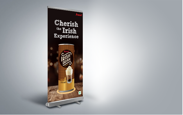
Almond was also entrusted with the task of developing the launch communication for the Brand including the Point of Purchase for retail and Social Media campaign. Almond was also responsible for developing short interactive video posts that went live on Amul’s various Social Media handles and helped in spreading the word.
The drink was positioned as a Mocktail – an alcohol free alternative to relish at parties, to say cheers with friends or even for self-gratification – basically for all good times.

The drink was positioned as a Mocktail – an alcohol free alternative to relish at parties, to say cheers with friends or even for self-gratification – basically for all good times.